I would like to start with a story. Meet Mark - Mark is a 50+ English teacher, who because of the current situation (we’re during the pandemic crisis as I write the article) is forced to run his classes online. The school didn’t give him any instructions, which software to use, so he has got a free hand to choose the one suiting him best.

Table of Contents:
2.1. Don’t write what you like - but what your users need.
2.2. Analyze data about your target audience & adjust content to them.
2.3. Don’t overwhelm your app users with too many details.
2.4. If you need some data - explain to the user why you collect them.
2.5. If you need some data - explain to the user why you collect them.
2.6. Give a description to the error pages.
Introduction
Mark spent hours testing Zoom, Messenger, Skype, and others - yet, none of these apps answered all of his needs. Then he saw an ad of the education software, that at first sight, looked like an answer to all of his struggles. So he decided to give it a shot!
As he enters the website, a big slogan hits his eyes “Do You want to make your online classes as engaging and exciting as the best music shows? Feel like Beyonce and rock your students’ world!”. Mark's eyebrows have risen a little, as sitting in his tracksuits and polo shirt he doesn’t feel like giving a single ladies dance show right now. But ok, it doesn’t mean that the software is bad so Mark keeps on scrolling the main page.
After the slogan, there were some testimonials of people who looked like Mark's children. He doesn’t see any quote written by someone similar to his age. He feels a little bit left behind but ok, maybe that wasn’t intended. He hasn’t seen the one screen presenting the software yet.
Finally! A mockup presenting how the app looks from the inside. He takes a look and sees that it presents nicely. Then, a looong list of features with description hits his face. He scrolls and scrolls waiting for the button that will tell him how to download it. So after passing by an online-charades and collecting themed badges features detailed descriptions, he sees the form. “Ok, just one step, and I will be able to try it by myself, finally!”.
But not so fast. The form says that you can set up your account using your social accounts (Facebook, LinkedIn, or Twitter) within just one click! But Mark doesn’t have one and he doesn’t want to create it now. So at the bottom, with the teeny-tiny letters he discovers the link that says “create an account without social media”. He clicks it and the horror begins once again. An ugly form, with 10 spots like Zip Code, Country, and his mother's middle name pops out. As Mark sees that, he is taking a break to make himself some herbs to calm him down.
But he needs that software because he cares about his students. So he comes back. He fills up the form, correcting it several times (the phone number format was wrong, the ZIP code format was wrong - you get the drill) and he hits “subscribe”. AND THEN. A huge privacy policy jumps out of nowhere in a separate tab, that you can’t just accept instantly - you have to scroll it down, and then agree. Mark is starting to breathe deeply but he is a teacher - he deals with stupid things every day, he can handle it. He accepts it and the page is starting to load again.
And it loads.
And loads.
Ever loading stooory, aaa, aaa, aaa. <Let’s sing together with Atreyu voice!>
“System error (code #87655445365789): An authentication error has occurred”
Mark flips the table and leaves the room. They don’t pay him enough to deal with this nonsense.

What is UX Writing?
UX writing is the practice of crafting UI copy that guides users within a product and helps them interact with it. UI copy includes buttons and menu labels, error messages, security notes, terms, and conditions, as well as any instructions on product usage. The primary aim of UX writing is to settle communication between users and a digital product.
I like to think that UX writing is about showing the user that you care about him/her and understand his/her struggles. So naturally, you want to guide him/her through your software as smoothly as possible! As you see from the example above - Mark didn’t even have a chance to try the software itself. He got spooked out by the things that happened before downloading it. All those slogans, forms, buttons, and functionalities description - that’s microcopy and it is the essence of UX writing, to make it user friendly!
In this article I want to show you, basing on the Mark example from the above all of the mistakes that you can make if you neglect UX Writing in your software. So as a result - you could avoid them all and craft awesome, user-friendly copy that will guide the user through your software without any manual & instruction needed!
#1 Don’t write what you like - but what your users need
The primary rule of the User Experience overall is to get inside your users' shoes. And this rule obviously applies when we’re talking about UX writing as well! Sometimes you can feel the urge, to add to your app some inside joke or slogan, that sounds really cool to you. When this moment happens just take a step back and focus on people who will interact with your app. Will they find it funny as well? Will they even understand the cleverness of your wordplay?
As you see from the example above - Mark didn’t get excited by the Beyonce reference. He was tired because of the difficult situation he ended up in and he needed a solution - not some millennial sales pitch. It doesn’t mean that it was wrong - just not here, not now. Those kinds of things are nice to have at the further steps inside your software - just like Mail Chimp did. The e-mail marketing platform even encouraged their users, to interact with its feature.
RT if you high five Freddie after you send an email! pic.twitter.com/1SdReuGNZu
— Mailchimp (@Mailchimp) July 20, 2018
#2 Analyze data about your target audience & adjust content to them
The work of UX Designer is primarily focused on collecting data & properly analyzing them. We all like different things when it comes to design and app flow and that is fine! You can’t satisfy everyone yet - but you HAVE TO focus on your users! Use Hotjar, Google Analytics or other tools to know your target audience as well as you can and then - adjust the copies on your website to them. Finding the right tone of voice to communicate with your target audience is strictly connected to your business overall Digital Marketing Strategy.
READ MORE ABOUT BUILDING THE RIGHT DIGITAL MARKETING STRATEGY HERE!
You might be surprised how small things can decide whether your persona will try your software or not. Basing on the Mark example: if you are not narrowing your target audience to a certain nationality, age, or gender, you need to make sure that you have testimonials for everyone. That you offer easy login without the need to have a set up social media account. To avoid the feeling of being excluded.
#3 Don’t overwhelm your app users with too many details
You really like your application, you’re very proud of it and you want to tell your users as much as you can about it. I get it. But we are all very busy these days. If you overwhelm your software user with a detailed description before you even give him/her a chance to test your product - you might lose him/her at the start. UX writing is deeply focused on communicating as much as you can, using as little words as possible. If you can cut down some words - just do it.
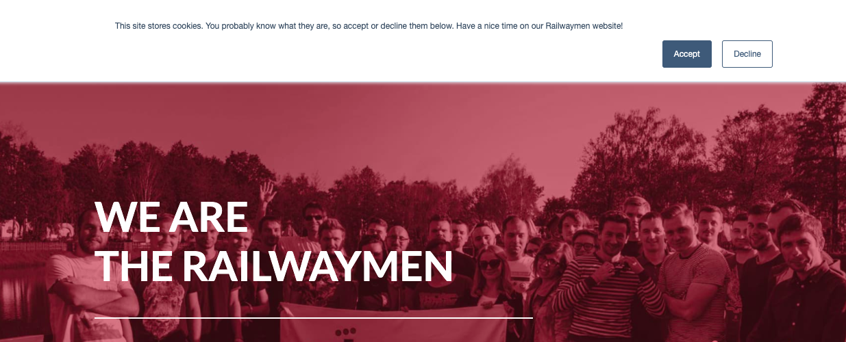
The same thing goes with the privacy policy and other documents, that you’re legally obliged to inform your users about. You don’t have to pop them in their faces. You can simply write one sentence, with the link to your documents and let the user decide, whether he/she wants to investigate it deeper or not. See below the example of how we managed to fulfill the information obligation about cookies on our Railwaymen website. Short, simple, and most important - in accordance with the law.
Another example worth checking is the Facebook Cookie policy. They explain to you WHY they collect cookies to make you feel much safer about it.

#4 If you need some data - explain to the user why you collect them
How many times have you typed a fake phone number to the form that demanded it from you? Me personally - a hundred times. I’m not gonna give my real number to someone if I don’t know why that person needs it. And most of the people think the same. UX writing can help you raise that phone number collection rate significantly by... simply being honest. Explain to your users at the form lever WHY you need that specific data from him/her. To call you and present your offer. To gather geolocation analytics based on the prefix number. To sell it to the call center company selling pots and pans (you might think here “lol” but some of the people still like telemarketing!). One simple sentence above the “phone number” bracket might change the world in this matter.

Getting back to Mark - he felt really confused why so much data was required for him to fill (the mother's middle name was a joke but I hope you get what I want to say ;) ) when all he ever wanted was to just try out your software. You can collect whatever kind of data you want - just explain to the user why you need it, period.
#5 Try to be as much self-explanatory as possible
Here is another matter connected with the forms (duh, they are very important as they are a very powerful lead generation source!) that UX writing can help you with. This one will avoid you having hundreds of emails sent to your inbox by people that got irritated by your form. Self-explanatory form brackets. I will explain it basing on the Mailshake form example.
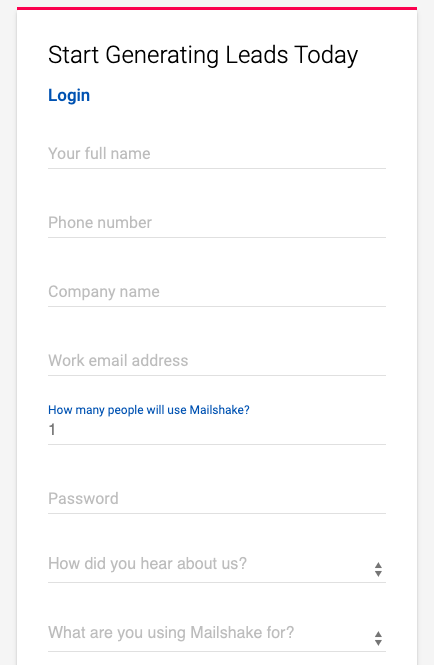
When you’re creating the account on this e-mail marketing platform you are seeing the form as above. Thanks to “Your full name” description you now, that you should input here your first and last name. “Work email address” will avoid people from giving their personal addresses, if they have a professional one. Those are these small things that make a huge difference when it comes to the quality of data you get from your users.
Even worse situations happen, when you don’t explain what kind of format you want to receive your user ZIP Code, phone number, etc. The outcome? Mark-like people who get frustrated by typing their data over and over guessing, what kind of format will be the right one. Be sure, that the User Experience is ruined from the start.
#6 Give a description to the error pages
Last but not least - UX writing is about treating your app user as your best friend. Would you let your best friend to get lost in the forest after a heavy party? I don’t think so. So why are you letting your user get lost at your page? I hate the situation, that I dedicate my time to create the account, type my data and at the end - I receive an error which doesn’t tell me ANYTHING about what went wrong. Is it a website temporary issue? Are some maintenance work now in progress? The database has been overload? Nope, we won’t tell you, we’ll just display you some long error code that you won’t understand at all.
Things like that are these small pieces that matter. They show if you really care about your user or not. See how LinkedIn is dealing with this kind of situation like a pro.
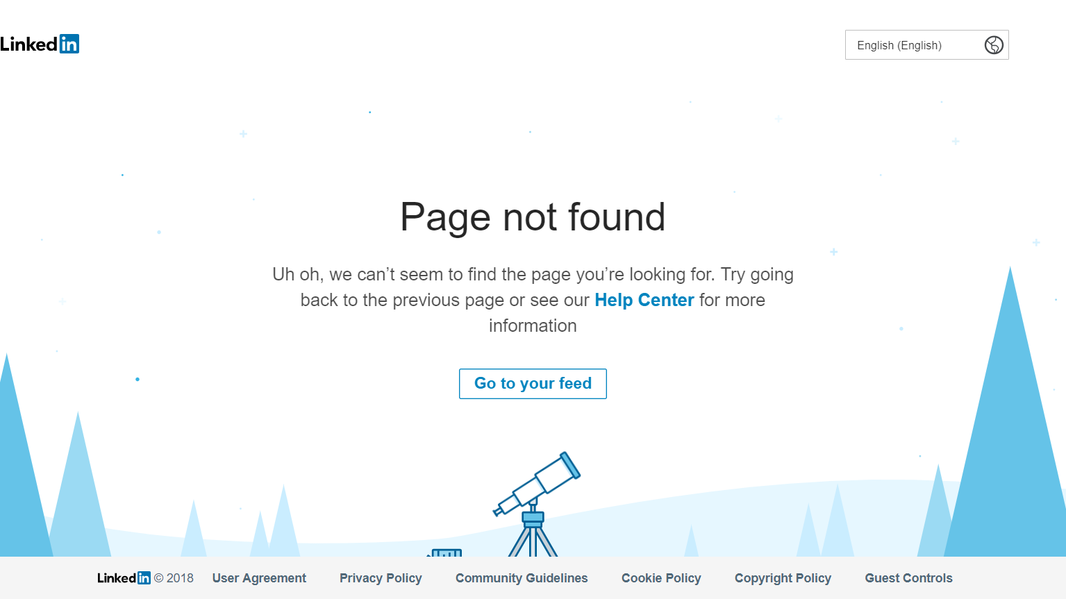
source: https://blog.fluidui.com/top-404-error-page-examples/
They’re not only telling you, what just happened but they guide you to some places that you can get help from. Oh, and it just looks nice with the telescope and the visual identity which complies with the LinkedIn guidelines. The communicate here is simple, clear, and friendly - a masterpiece of UX Writing for sure.
Conclusion
Poor Mark - all he wanted to do was to be a better teacher to his students. But even the most dedicated person has its own limits. I’m very glad that UX Writing is becoming more and more popular lately. The idea, that technology, and software HAVE TO BE difficult and limited to people who know computers very well only has to fail. The current situation with the pandemic shows, that we all need to know how to deal with the tech - despite the age or geolocalization. Luckily, more and more app owners start to see that there are people excluded from the tech revolution who want to catch up.
A new social app that we have recently built called Findow is a perfect example of software that helps them to achieve that.
UX writing is like being the most empathic person in the whole world - I know that you are struggling, I understand that you might not know this, so I will show you how to make it right. I won’t judge you, I won’t laugh you out, I’m here for you. Because only together, we can achieve something awesome!
UX Writing is not the only trend that is being popular lately. Actually - pandemic changed a lot in our society, and those changes will stay with us for longer. Some of them have bigger growth potential than others - maybe you can find the use for them in your business?
Read about 7 Technology Trends With The Biggest Growth Potential Right Now!