You may have noticed that Railwaymen has a bit of a different look today. Yes, you're right - our homepage was redesigned. You never get a second chance to make a first impression so we've made a few changes to improve the user experience.
Table of Contents:
People and atmosphere
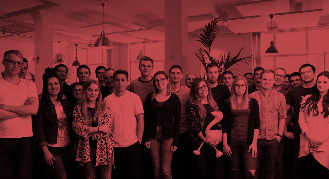
Firstly, people and a good atmosphere are significant factors for us, so the key element was the preparation of the photo session of our team. We didn't even think our team is so big, until we saw everyone (almost) in one photo.
So here we are - Railwaymen Team!

Our website
Secondly, after analyzing the users’ traffic on the website (Google Analytics and Hotjar heatmaps), we decided to remove unnecessary elements so now the site is simpler and more transparent. After many brainstorms, our Graphic & Front-end Developer - Agnieszka prepared the whole new project that met all the requirements.
Thirdly, we know that navigation should be intuitive and easy to understand for a first-time visitor. For this reason, we’ve made several updates and we’ve facilitated access to current job offers at Railwaymen for people interested in careers in our company, by adding an appropriate link in the navigation. We made easier the process of the preliminary estimate of the client’s project - currently, the user can do it on the homepage.
Changes
Changes are primarily aimed at displaying the portfolio consisting of the projects that we have successfully implemented. Our portfolio includes over 70 completed success stories for clients from around the world, with many different industries, e.g. construction, healthcare, real estate, education, fintech or IoT. You can read more about case studies.
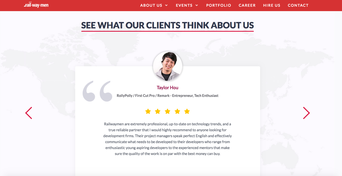
85% of consumers trust online reviews as much as recommendations from a friend or family member. When it comes to business, the success depends heavily on word of mouth. Testimonials and feedback from clients are a great tool to show that you are trustworthy and strengthen the credibility of you and your business. That is why you can check what our clients think about us and our work on the new homepage.

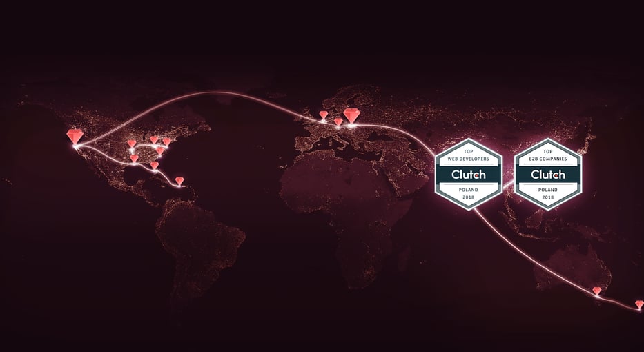
We also want to show the prizes that have been awarded to our company. Any awards or certifications speak to the quality of work and create your image as an expert in your field. Do you know that last year we were recognized as Global Leaders, Top Web & Software Developers and Top Ruby on Rails Developers by Clutch.

There are also more CTA buttons encouraging the user to interact with our site. Thanks to these changes, the user is able to easily find the information that interests him.
You can easily find the social media section on our homepage and check the latest posts. There is also a video, which shows what we do, how we work, how we manage projects and generally you can meet us better.
Homepage is the first visual and emotional touch to the website and the first meeting with users. We hope this redesign will improve your online viewership experience, so let’s start the journey together!


.jpg)


