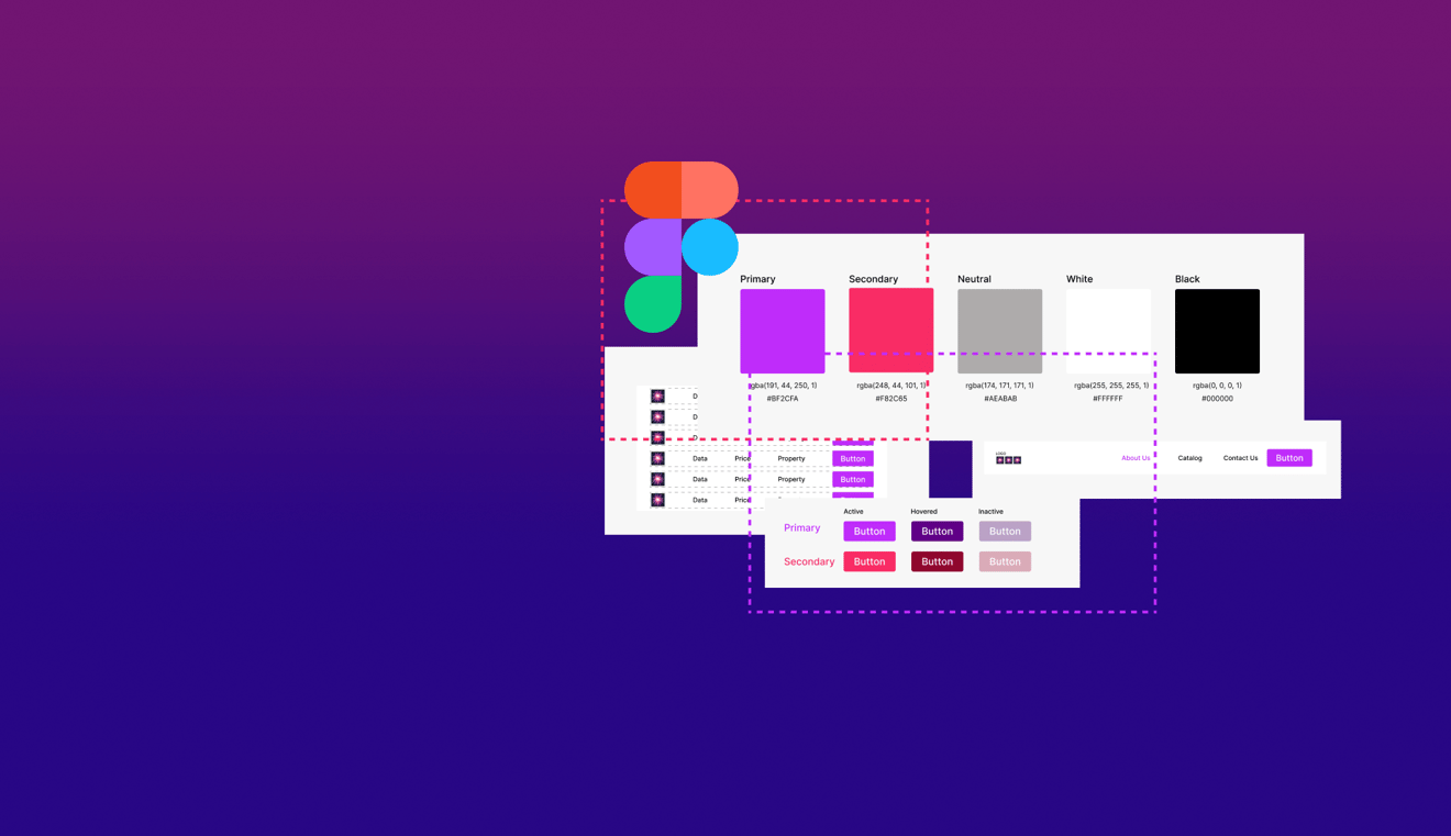
Design System is a set of detaily created UI elements sets and patterns which are used in interfaces. It’s an important part of every UI as it drives the brand's image and the attention of a user on common elements. So it gets easier for every user to adjust to the platform or service faster and intuitively get to the desired point of the interface without huge efforts. Basically the design system is a set of buttons, navigation bars, colors, fonts etc, which are repeatedly used in the design.
Table of Contents:
1. Why do designers need a design system?
2. How is the design system structured?
3. How to create a design system? Tools for Creating design system.
4. Popular and widely used design systems.
5. Why is it good to have a design system in your company?
Why do designers need a design system?
When designing the pages and developing an interface, it is much easier to have a set of previously created elements, which are repeating on the page. It's also very handy for developers, as they don't have to do the monotonous work of developing each element separately. This solution helps designers avoid the design problems that often arise. With a wide base of pre-approved elements, designers can take on bigger challenges. That includes an intuitive flow that users appreciate.
These are not the only conveniences that designers see in design systems functionality. Among the many advantages, they often point to design consistency, better performance, or even the ability to scale. Thanks to such features, designer's work becomes much simpler and organized.
How is the design system structured?
There are some well known approaches on how to build a design system. Moreover the approach depends on the project size and specifics. The widely used approach is the Atomic methodology which was proposed by Brad Frost. The purpose of this method is to create a detailed system from scratch following the Chemistry science path from creating Atoms ( the very first and the smallest part of elements) to Pages (full view of repeated UI elements, composed from previously created parts). Let me briefly guide you through every part:
Atoms
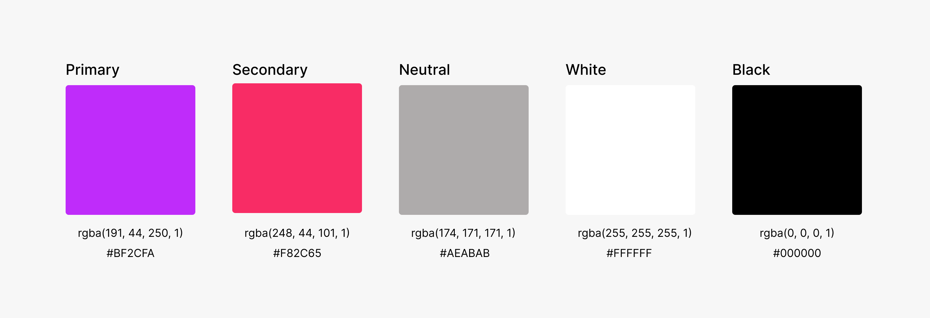
A very first and smallest part of your design system. There should be prepared certain colors, fonts and any other core elements which will be used in the future. Important note here, if the design system should have more than one color in the palette, its a good practice to start marking them with appropriate naming conventions. Most of the designs have Primary, Secondary and Neutral colors.
Molecules
Following this path, molecules are composed of atoms that have already been prepared. All to take on new properties or perform a specific function. These can be created forms, inputs and buttons. It is very important to show the states of particles such as buttons, such as hover, press and inactive. It is very important to create these at the very beginning to maintain design consistency.

Organisms
Once the basic molecules are created, it's time to combine them into organisms. It might be a navigation bar, which consists of button molecules, logo molecules and navigation list molecules which have a property of the font atom. When you combine the molecules and atoms into an organism, you get an elaborate element that will play an important role in the product.

Templates
Templates consequently are the set of organisms and molecules combined together. As an example it can be a navigation bar, mixed with an information block and footer, which were previously created as organisms.
Pages
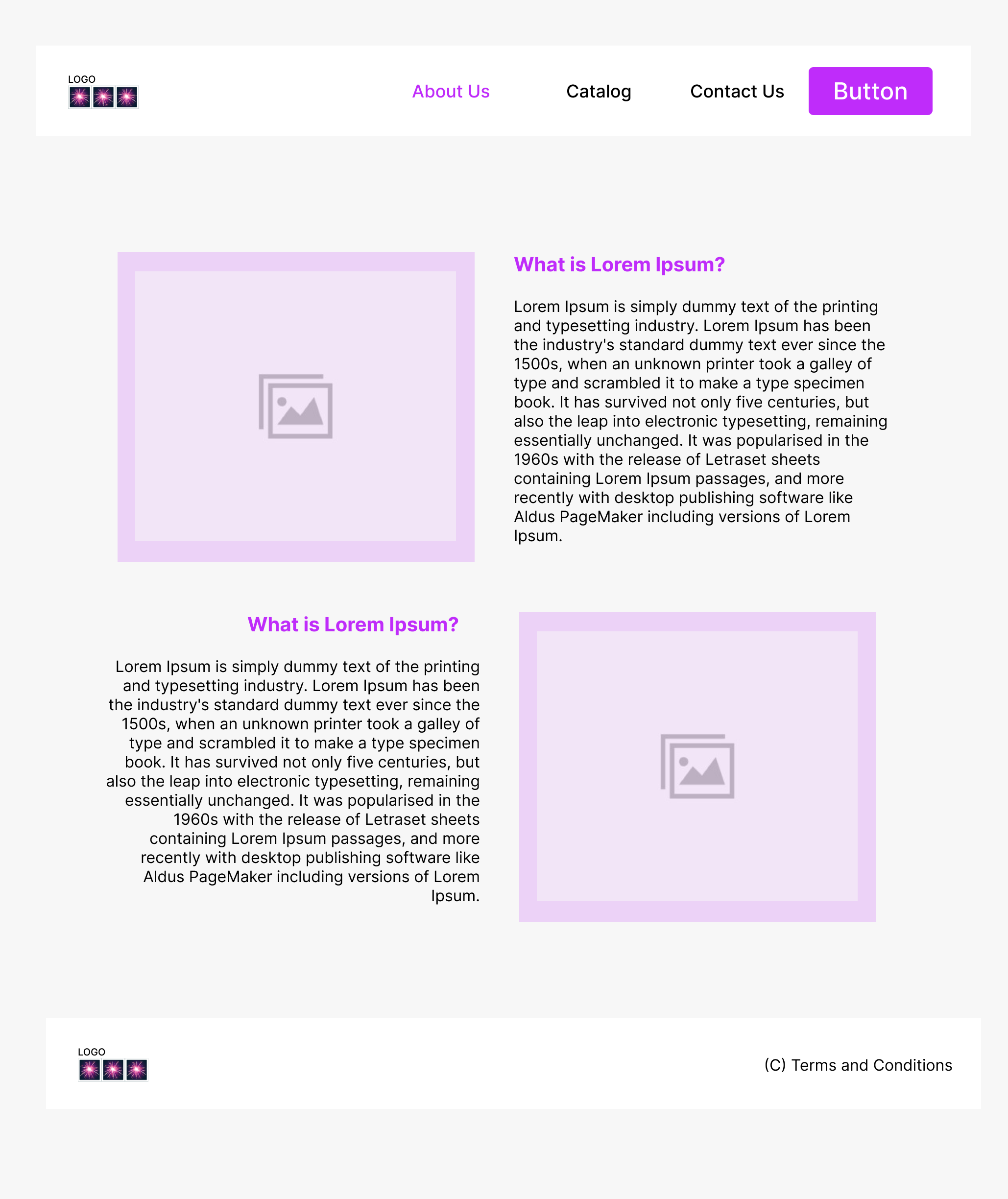
This is actually the final stage of the design system, where templates are combined together with a certain consistency and bring logic to the desired output. It can be a full scrollable page with all the elements which were created earlier and might be repeated on next pages and always support the primary style and consistency.
Even if the design system is created, it doesn’t mean that in the final design there shouldn't be elements which don't exist in the system. The design system is only a set of patterns and a step by step set of consistent elements, which should be supported and used in the design.
How to create a design system? Tools for Creating design system
As mentioned above, there are several good practices that can be followed for creating a good, consistent design system.
- Naming Conventions helps to differentiate between elements in every step of creating the system. For example, if there are several colors used in the system, it's a good practice to give them names like Primary, Secondary, Neutral instead of RGB or HEX codes. It's very convenient in order to not to be lost in a bunch of color scales or shades. Following the color naming conventions, fonts also might be named accordingly. For example there might be two or more fonts of different size, opacity or style. Naming basic atoms or elements will be very handy throughout the process of creating the system.
- States of the elements. It's crucial to have already prepared states of buttons or any other elements in the system as we never know if the button or input form should be used under certain conditions or is blocked for usage in a certain moment of time like for buttons the basic states are Hovered, Inactive, Pressed or for input elements states of Active, Inactive or Error when the field is empty, but the condition for this input is not to be empty.
- Consistency. Once there is an element or a part of the system which was created, it's a good practice to use it across all the interfaces without changing its basic parameters.
When it comes to the tools, a good choice would be Figma, as it has already prepared interfaces for creating design systems and it's very easy to follow the atomic principle and create reusable components. Moreover, Figma has a set of plugins, which can easily automate the process and help to focus on core parts while creating the elements. In order to start creating a very first design system, I would recommend taking a look at some official tutorials in Figma.
Popular and widely used design systems
A widely known and recognizable design system nowadays created by Google. You can easily recognize whether it's a google related service or not only by taking a glance at small parts of the interface. Many designers take inspiration from it while creating their own system or even taking some elements as a pattern for a new design system.
Apple Human Interface Guidelines
A very powerful design system, which is widely recognizable is the Apple one. This one is used in iOS related software and became a new brand for usability and consistency. By working on interface consistency and intuitiveness, Apple's Human Interface Guidelines influence the user experience. This also allows you to apply visual design and prepare consistent access and maintain common interface elements.
Microsoft Fluent Design System
One more widely known and recognizable design system which is used in Windows and its products. As all of the above it's also an open-source, cross-platform design system which is constantly updating and improving its framework. Microsoft's tool relies on the simplicity of the developer ecosystem. This way, all partners can benefit and create their own unique solutions at the same time.
A popular design system which creates an image of the company and is very recognizable in Attlassian Software like Jira or Confluence. The structure pays great attention to the users and their experiences. The high quality of this system translates, among other things, into the exploration of ideas for design by creators.
Salesforce Lightning Design System
Salesforce built design system frameworks focusing on accessibility and flexibility as one of the core parts of the system. It's a very recognizable system as well and became a good basis for projects with creating mobile and desktop applications.
Why is it good to have a design system in your company?
First of all, the design system creates a part of a brand and image of the company. The colors, patterns and set of elements can be used across the company products and build an associative line between the client and software and become recognizable. If there is an opportunity to create a framework for your company, it's a great time to start.

