There is no application without UX/UI design. It is simply impossible. First of all, we need to do research and find out the aim of digital products and who will use it. To do that, at Railwaymen, we organize workshops with our clients. We always want to know about the app as much as possible. Then UX/UX Designer can start their favorite part - app visualization. We can distinguish 3 digital visual representations: wireframes, mockups, and prototypes.
The way to execute these factors is as follow:
In the beginning, based on user flow diagrams, we can prepare quick sketches on pieces of paper or whiteboard. We want to catch the base idea of our product. If you use a whiteboard, remember to take a photo of them. Next, we move our ideas to digital wireframes. Then we need to prepare mockups. It’s hard to place prototypes in the queue cause we can prepare from wireframes or from mockups.

01 Part of the diagram, 02 Sketch on paper (1 view), 03 Digital wireframe (1 view), 04 Mockups (1 view)
Do we need them all?
No, to implement a product for sure, we need wireframes and mockups. Prototypes are additional things. Later, I will try to convince you to invest in them also.
Time spent on preparing each of those factors depends on the complexity of the whole project, but definitely, it’s an important element of the whole process of building a product.
There are a bunch of design tools that we use to prepare all of those factors. I will list them also in the following part of this article.
Table of Contents;
1. What is a wireframe in app design?
2. Why wireframing and who can do this?
3. Wireframe vs Mockup vs Prototype: What is the Difference?
4. Types of visual representation of product in app design.
5. Why does every app need Wireframes, Mockups, and Prototypes?
What is a wireframe in app design?
According to Anton Suprunenko and his article on Smashing magazine wireframe
"(..) also known as a page schematic or screen blueprint it is a visual guide that represents the skeletal framework of a website or an application".
Following this line of reasoning, wireframing is:
"(..)a process of designing wireframes, and commonly used to lay out content and functionality on a page which takes into account user needs and user journeys. Wireframing is used early in the development process to establish the basic structure of a page before visual design and content are added."
Wireframing is a design process of rapid sketches and is the best option to introduce a simplified version of the product quickly. Wireframing should precede the development process. It is supposed to be the next step after collecting the most important information about the product. Wireframes are prepared based on previously prepared diagrams that tell us what kind of steps the user must take to achieve the goal with your mobile app or web app. App wireframes design helps prepare the most important views and present the whole product's main flow.
Why wireframing and who can do this?
Wireframing is the first and really important part of product visualization. Let's first focus on that. For sure, it is worth investing time in sketching concepts because we would be blind without it.
It's like starting to build a house without an architect's project.
Maybe a house will rise, but it wouldn't have solid foundations and thoughtful construction solutions.
I think that anyone can prepare wireframes. You don't need to be a technical geek or a designer to prepare a quick sketch on a piece of paper. It often happens that our clients send us the initial sketch of a concept made by themselves. I found that really helpful. As a UX Designer, I more understand the client's idea, which is a very good base for more detailed wireframes. A sketch is also a form of visual confirmation. Thanks to them, we have the same understanding of what is written in the documentation.
To build wireframes, UX/UI Designers often use tools with ready-made UI (user interface) elements that can be quickly assembled like puzzles. In this case, I often use:
- Miro,
- Figma,
- Whimsical.
Those tools are intuitive and easy to use. Another advantage of preparing views with digital tools like these is that we can mark some elements of designs and leave comments. Also, several people can work on projects at the same time, which we often use during workshops with the clients (so during workshops, we can together prepare some wireframes).
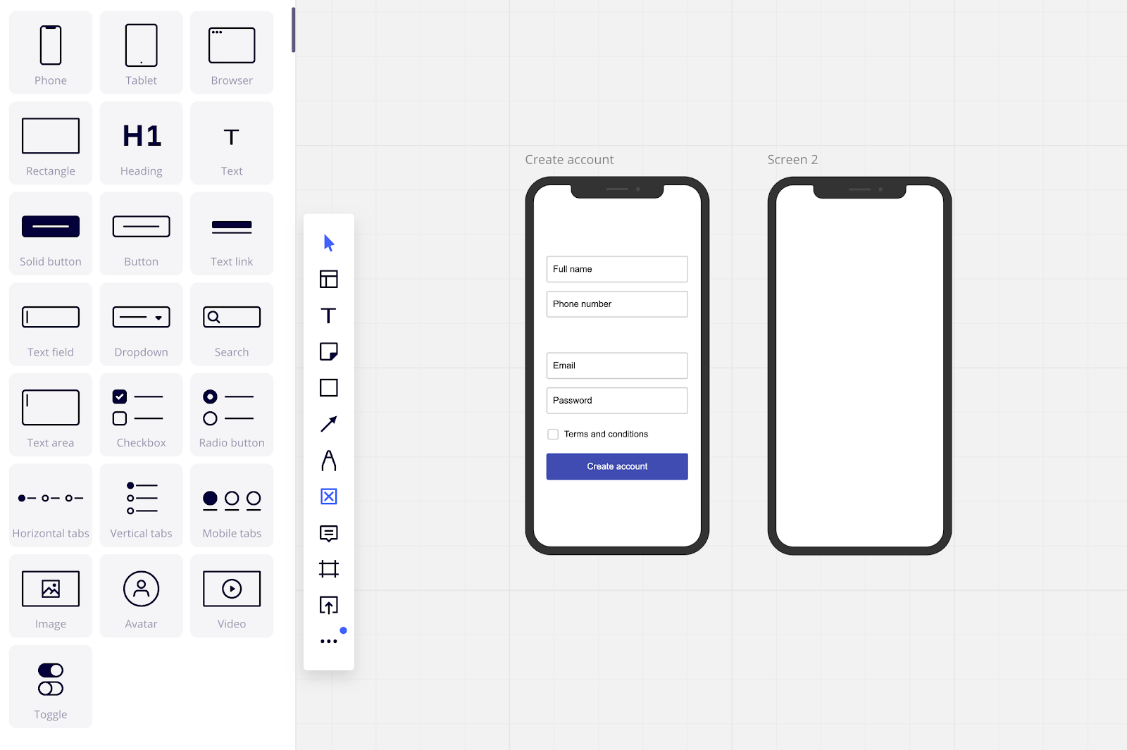 Print Screen from Miro which we often use during workshops with the client.
Wireframe vs Mockup vs Prototype: What is the Difference?
We often come across names like wireframes, mockups, and prototypes. All of them are intended to show how the application will work, so what is the difference?
Basically, they differ in the level of detail and that some are static pictures and others are interactive views.
Wireframes are the most basic and static pages. Usually, we prepare in the grayscale because, in this stage of product design, we need to focus only on elements that should be displayed.
Mockups are the static views that the client is most often waiting for. They have more details than wireframes (e.g., logo, branding colors, images), and basically, they represent how the final product will look and work. If we add interactions to Mockups, then we’ll get a high fidelity prototype.
Low and High fidelity prototypes are product views that contain interactions. We used them for user testing.
Types of visual representation of product in app design:
As I just mentioned, we have several types of visual presentation of the digital product:
- Wireframes,
- Mockups,
- Prototypes (low and high-fidelity).
Below I will try to explain again what they are and when to use which type. Let’s dive into the first one.
Wireframes
At the very beginning of the design process, we prepare wireframes. Those quick sketches allow us to check the concept itself and the main flow of the product. Their goal is to show the application's main flow, what elements and content should be on the page. They should be clear. We don't pay much attention to the visual aspect of the design. They are the first step after gathering all the most essential information about the product. We can also use them to prepare clickable prototypes.
How to prepare?
In the beginning, we can prepare it even on paper. It’s the easiest and probably the fastest way to capture the first idea. It’s easy, and it’s cheap, you can prepare many views in a short amount of time, you can easily change your concept. As I mentioned before, everyone can do this. All you need to have is a whiteboard or piece of paper.
In the next stage, we need to move our ideas from paper to digital views. We can draw it with a design tool with ready-to-use elements. Nowadays, most digital tools to prepare wireframes are free, easy to use (you don’t need to be a technical geek to use it), and what’s more important, we can use them on our browser. At the same time, several people can work on them, which is really helpful during online workshops with the client. There is also the possibility to mark some elements of the views and leave comments.
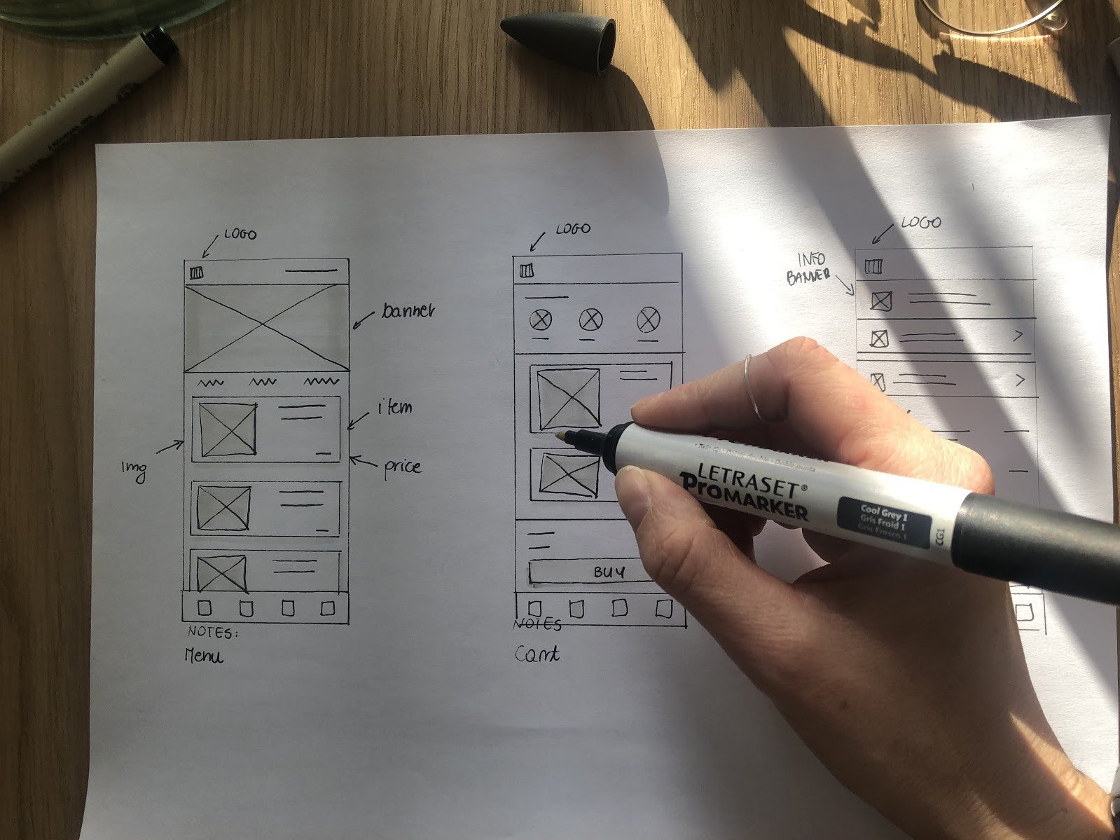
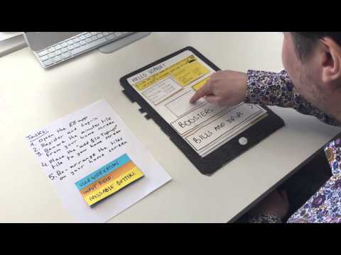
Example of the paper wireframes
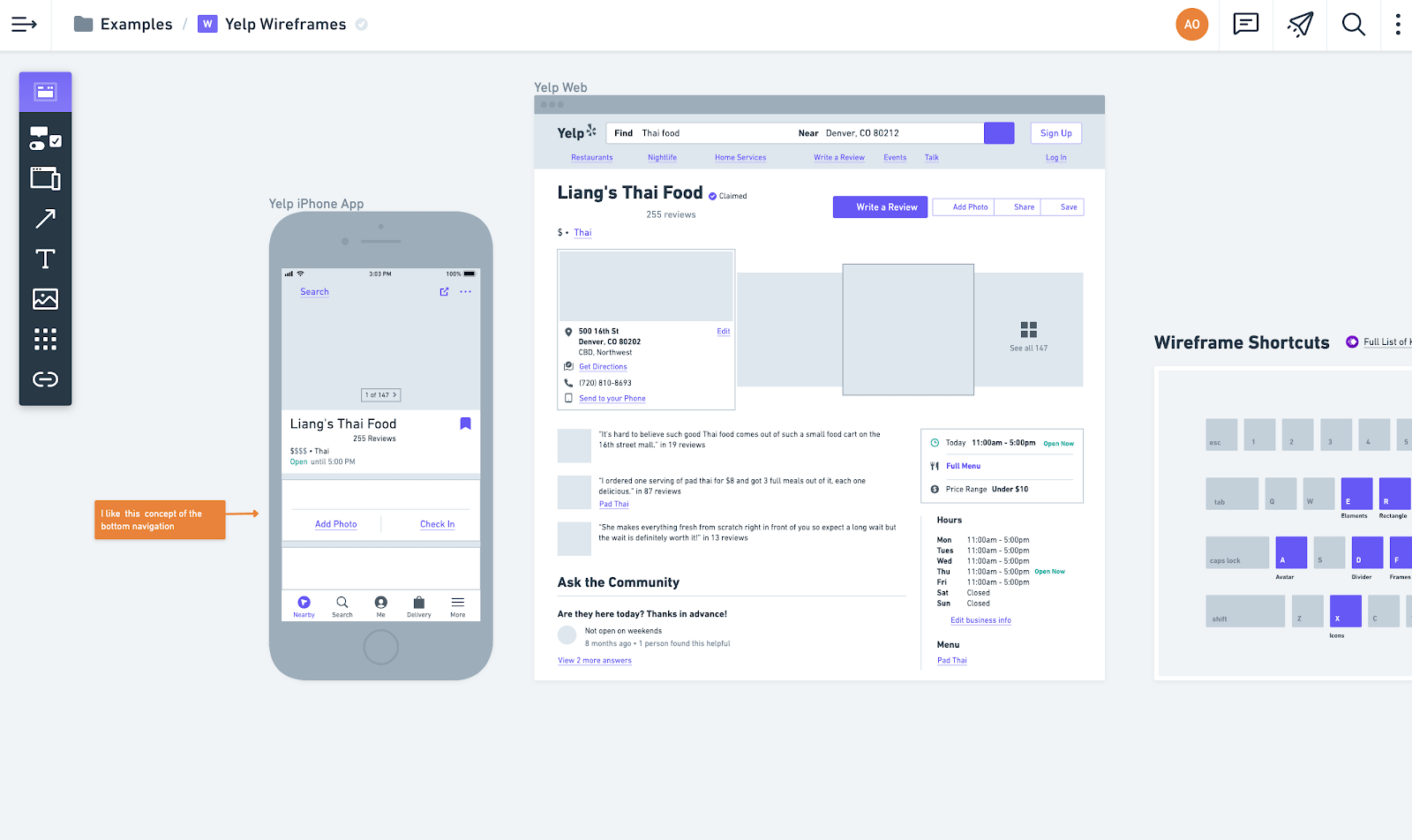 Print Screen from Whimsical - web tool to prepare quick wireframes with already made elements, icons etc. You can also add some comments.
How much time does it take to prepare them?
The main advantage of wireframes is that we can quickly produce them. If we previously gather all the information about the main user flow and know what kind of steps users need to do in our application, preparing wireframes is a quick thing to do.
When to use them?
Always :) From my perspective, they are mandatory for each project and recommended for people who want to present their idea to investors without prior implementation.
Wireframes help to introduce the main idea of the project for developers. So we can consider them also as a part of the project’s documentation. Even if we don’t have a final look at our project from this point on, developers can start backend implementation cause wireframes covered all functionalities in the application.
For instance, if I know that we need to prepare an in-house administration panel and do so, we will use external libraries, then I always prepare wireframes. I only outline for developers where a given element, e.g., chart, tables, should be placed. The developer’s team knows well what needs to be done and what kind of elements from the external library they need to use to build the admin panel.
Mockups
The next step is to prepare static views that are richer in detail. Once we have wireframes and the whole concept is accepted, then we prepare mockups. We align all elements into a grid, choose the fonts' size, and add some colors and patterns. After applying those elements, we have more detail and visual representation of our product.
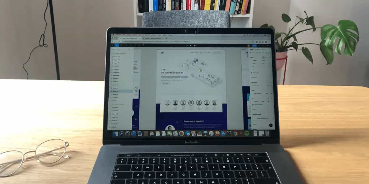
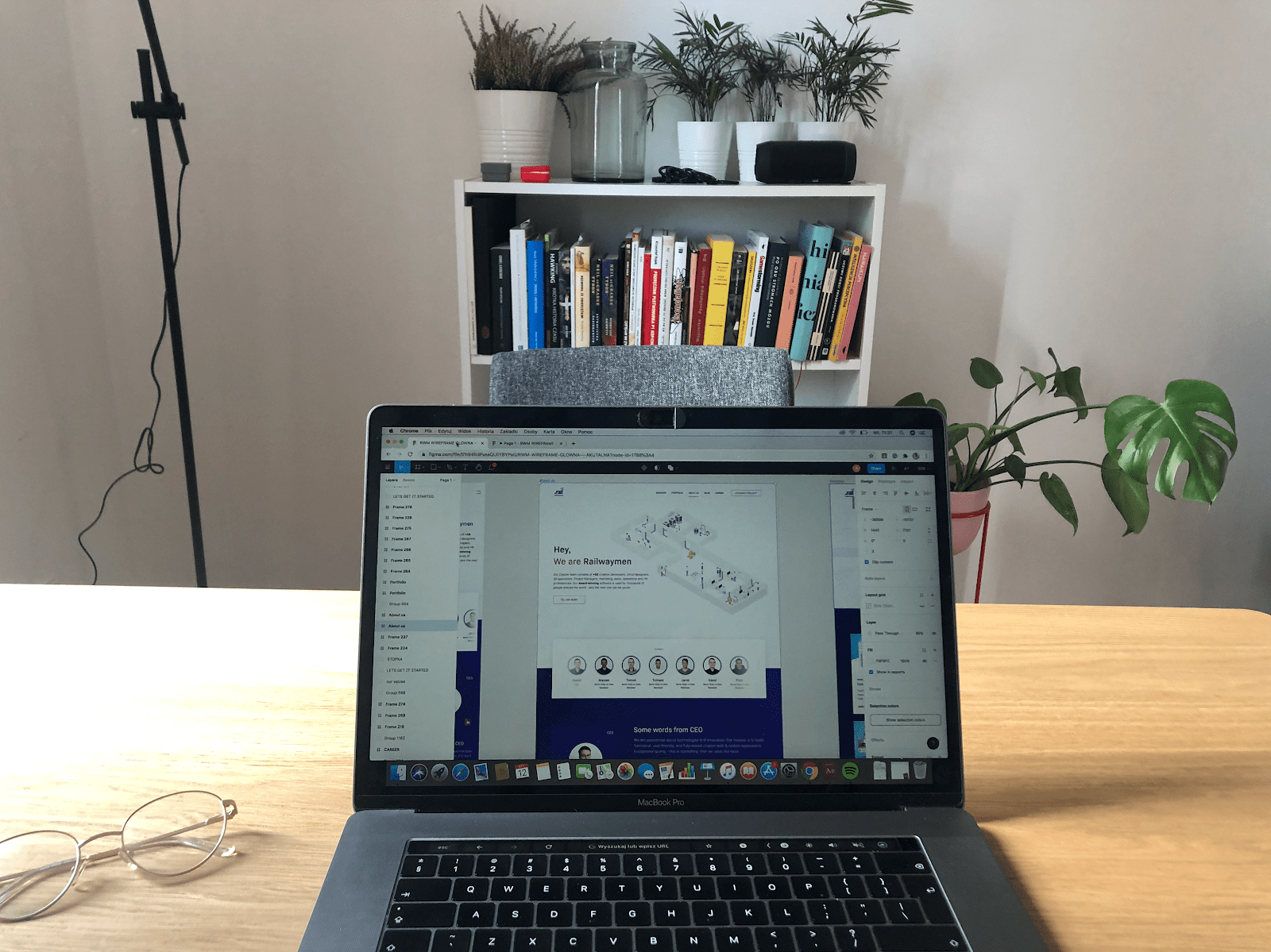 Mockup of RWM website prepared by our UX/UI designer Patryk
How to prepare?
For sure, it's much easier for us - designers if you have some branding guide. Agency can prepare it for you. In the basic version, they will design a logotype, color palette and will pick up fonts that we can use to build mockups. So we save time because we don't have to consider what kind of font, colors, icons, illustrations we should use. We already have it from your branding book.
Designers create mockups in a digital tool. It can be the same tool in which we prepared wireframes. W often use tools such as Figma, Adobe XD, Invision, Sketch. All of them work in the same way and allow us to present our design work to the client. We can share views by a link or give artboard access when a client can leave us some comments.
How much time does it take to prepare them?
It depends on the complexity of the project and for how many platforms we will prepare the design. If you have plans to build a mobile application, it'll be rather one resolution (maybe with a distinction between Android and iOS).
If you have in mind a web application for sure, you should design mobile and web visualization. The essential thing is that if we have a web application: on this step, it's crucial to check how our product is going to work and look like on mobile devices.
The best practice is to start designing for mobile devices and then prepare a web view. If the elements fit on small devices, we can be 100% sure that they will also work on the desktop. It's worth checking which platform is most popular in your target group. For instance, if users use tablets, make sure also to prepare a view for this device.
If you have well-prepared wireframes, it shouldn't take much time to prepare the final look of the applications.
When to use them?
The question should rather be when not to use them. For example, if you first want to attract investors and show the idea itself in a presentation, I think in this situation, wireframes should be enough. But if you're going to bring to life your product for sure, you will need it! Mockups are crucial before frontend implementation! As designers, we also attached some guidelines for frontend developers on how every element of our design should look like in the different states (e.g., active, inactive).
Mockups, as a representation of the final app look, will be used to prepare high-fidelity prototypes.
Prototypes
Prototypes are interactive representations of our product. We can distinguish the low and high- fidelity prototypes. Both of them we can use for user testing. For low-fidelity prototypes, we can use digital wireframes or even paper sketches to test your idea with potential users.
You should use them at an early stage of product design and If you want to test, e.g. the main flow or information architecture with simple interactions. Below you can watch the YouTube video in which you will see user testing with the paper prototype and with digital wireframes.
If you want to know how your target users feel about your product, gather their opinion about design, or test particular elements (for instance, search fields), you should use a more detailed high-fidelity prototype. To prepare them, we use our digital mockups.
How to prepare?
For a low fidelity prototype, we can use sketches or already prepared digital wireframes. To design a high fidelity prototype, we need to have mockups in the order of mains user flows. Then you need to consider how detailed you want the interactions and animations to be.
Based on these thoughts, you can choose the right tool to do it.
If we need to test just basic flow, we can only prepare some basic interactions like the simple transition from one view to another. We can prepare it in Figma and give the possibility to test it by themself. Figma has an application called Figma Mirror, by which you can test it also on your phone. If we want to test some design elements like, e.g. drop-down menu, we can prepare a prototype in UXPIn. We need to spend more time preparing it, but we’ll get more sophisticated interactions.
Also, here is an example of a simple hi-fidelity prototype of our contact form:
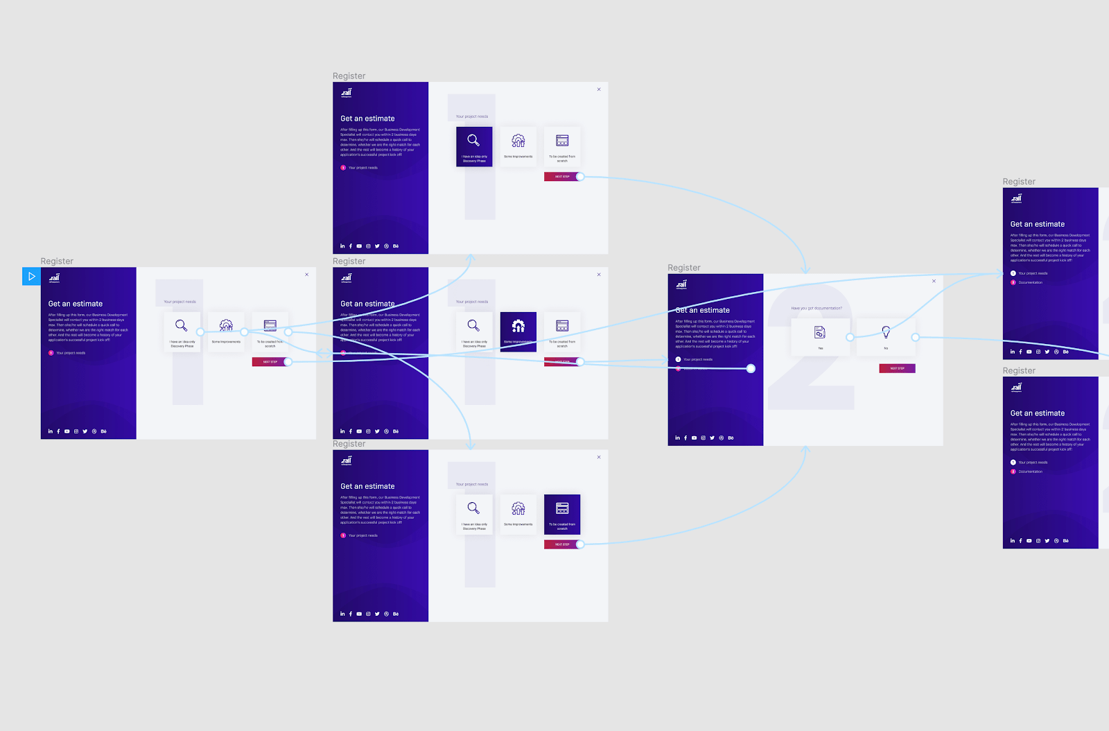 Print Screen from Figma - Preparing simple hi-fidelity prototype
How much time does it take to prepare them?
Prepare a simple prototype, and it should take a few days. Prototyping more complex interactions can take over a week of work.
When to use them?
For sure, we should use prototypes when we have already prepared wireframes and mockups. I also suggest using them to test it before implementing the product. I would highly recommend user testing because it helps catch all pain or weak points of our product. It helps to save some money on implementing unwanted results. Finally, clients can better fill how this product is going to work after implementation because of interactions. You can also use clickable prototypes during pitches and presentations. Interactive product presentation should appeal to the imagination of potential investors.
Why does every app need Wireframes, Mockups, and Prototypes?
I hope that I convinced you that user experience and design process are an indispensable part of app development. Now it’s time to sum up. Why are factors like wireframes, mockups and clickable prototypes important?
- They are essential elements of product design.
- Preparing wireframes help us to capture the whole concept of a product.
- Using a clickable prototype, we can test e.g. our main flow before implementation.
- There is a part of the documentation which helps to introduce the whole team to a project.
- Preparing wireframes or testing a clickable prototype with users help save budget spent on implementation of wrong solutions (we can test it before implementation and catch the most critical mistakes in the flow)
- It’s easier to make changes on wireframes, mockups, or prototypes than on an already implemented product.
Conclusion
Investing in the preparation of wireframes, mockups, and prototypes is an excellent step to put on a valuable market product. Indeed, preparing them increases the amount of money we want to spend on building products, but not as much as the implementation features your potential target group doesn't want.
Digital representation of views should be clear, put in the right user flow order, updated, and if needed, have comments in which we explain to the developer how some functionalities should work. It will help avoid any misunderstanding for you and the developers' team.
The client gets wireframes and mockups as images and also in editable files. You can use wireframes, mockups, or clickable prototypes for pitches and presentations for investors or use them as documentation during implementation.
Creating wireframes, mockups, and prototypes is an essential part of every UX/UI design. No matter you want to develop a mobile or web app, you can not skip this step. Read more about designing digital products:
UX/UI Design Process Steps: How Does it Look Like in Railwaymen?

.jpg)


