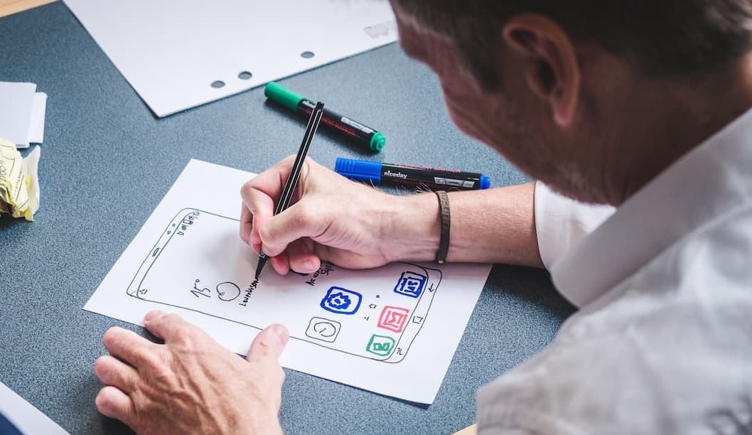
Icons are an integral part of any application. By using them, users are able to navigate through the site properly and take full advantage of its features. They can be both an exciting and characteristic element of a digital product, and useful and legible for the application user. This time I will discuss a list of trends in icon design in 2025. However, before you choose your favorite direction, it's a good idea to fill in information about the functions icons perform in a digital product.
Table of Contents:
1. The Role of Icons in Digital Products: Function and Style Considerations.
2.4. Graphics with color spot.
2.7. 3D and 2D with perspective.
3. Which style will be best for your application in 2025?
The Role of Icons in Digital Products: Function and Style Considerations
What is the role of icons in the application? In addition to their attractive appearance, their purpose is to provide the user with information about their use. The function of a given icon should be easy to read at a glance. Therefore, when choosing a style, it is always good to be guided by whether the icons will remain legible. In addition, a good practice is to match their character with the visual identity of the entire product.
Icons can also be a characteristic feature of the application and evoke associations with the brand, so it is worth choosing a trend that will harmonize with the goals of current and future recipients of products. It’s good to know who your potential users are and what will make them click on the icon. If you need to find out who the product user is and what their expectations are, we recommend that you take a look at the materials on our blog about the Discovery Phase workshops.
Trends in icons in 2025
Some of the trends that will be very popular this year are familiar. They can be called a continuation of proven and well-received trends from previous years. It is worth noting that 2025 will offer a wide range of styles that will be able to meet the needs of many projects.
Gradient icons
The fashion for gradients still holds a high position. Icons with color transitions are obvious against the background of minimalist applications. This ensures that the user's attention is drawn to clickable elements through visual appeal. It is good to remember the choice of colors that not only match the visual identification of the product, but also have the right level of contrast to look good on various backgrounds.
Minimalism
Another legacy after previous years is minimalism in design. It is a style that will always defend itself due to its universal character. Many colors and shapes can give the impression that the icon is overflowing with content. This, in turn, may blur the original perception of the function of a given icon. The strength of minimalism is the precise "less is more" and its neutral appearance, which can be matched to the interface, for example, by the color of the brand. Minimalist icons can also be highlighted with a different color that can be an accent throughout the minimalist UI design.

Bold icons
Minimalist icons built on the basis of lines are gaining a stronger character this year. All thanks to the trend of thickening the lines. The line can have a round end, like the new icons on Twitter, or end at a right angle. By making the line thicker, you can enlarge the icon, which makes it easier to click on it. In addition, when using a color gradient style, the visibility of this element is also improved. What is worth paying attention to is leaving a larger area of isolation around the icon.
Graphic with color spot
The combination of a patch of color with graphics can be seen in other trends, but it is worth devoting a few sentences to it because it can take on a different visual character. Linear icons appear with an added shape filled with color. Hand-drawn icons also have this treatment applied. Even in 3D icons, you can notice the background in the form of a patch of color.
Flat icons
There will be no surprises here either. Flat design is expressive yet simple, thanks to which it fits well with other styles. Graphics in this style are characterized by a lack of shadows, depth, and many details. In addition, the icons are based mainly on referring to the color and shape of a given object.
Hand drawn
For projects that allow more freedom and require a distinctive look, 2024 proposes hand-drawn icons. Designers can adjust the thickness of the lines, color spots, or the level of detail. In addition, leaving some imperfections when transferring the design from paper to digital can add a more individual look to the icons.
3D and 2D with perspective
The already mentioned principle of designing icons so that their function is legible is reflected in the trend for 3D and 2D icons with depth. This style leaves a lot of maneuver to the designers when it comes to providing detailed information to the user. Graphic elements correspond with their appearance to objects known from everyday life, which makes the message almost literal. The user does not have to wonder what is hidden under such an image. With such a design, you can place many thematic elements within one icon. In addition, thanks to them, they also offer a lot of different layouts within one set of icons.
However, it must be remembered that such extensive icons are quite heavy when it comes to screen composition. In addition, you have to be careful when choosing the visual part for the nature of the project. Such icons may give a less professional impression. You should also be careful with the selection of such icons for the content on the page because they can effectively distract the user's attention from them.
Abstract simplification
If the design and nature of the product allow for a bit of madness and lack of literalness, you can consider icons in the form of abstract graphics. Such an icon can be geometric, based on color shapes that suggest what lies beneath them. However, care must be taken that the image is not too random. The icon should still be usable. It may be a good idea to make such icons in the brand colors of the product.
Which style will be best for your application in 2025?
As you can see, 2025 is rich in trends. The multiplicity of trends and styles can lead to quite a bit of confusion when it comes to designing digital products. An icon cannot only be a visually attractive graphic element. Designing icons is a complicated process. A good icon design has elements of UX design, thanks to which they fulfill their task and do not evoke negative feelings when using them. The set of icons also needs to be visually consistent. However, the icons themselves are not everything and they are not independent works of art. Icons are part of the application.
Each application project requires an individual approach, and the most fashionable graphics will not suit everyone. First of all, they must reach users and build positive associations with the product. They affect the attractiveness of the application, and the result may be the subsequent success of the product. However, icons alone will not ensure a successful design either. The design of the application requires a comprehensive approach and, above all, getting to know the users to be able to choose the perfect style for the product.
Explore the opportunities provided by the Discovery Phase workshop
I recommend reading our free e-book about the Discovery Phase workshops, during which you can define the user, design the ideal path of using the application and prepare all the necessary information for the future project. Without analysis, it is difficult to match the artistic expression to the project, which will also accurately appeal to the taste of potential users of the application.
Check out the Discovery Phase workshops organized by Railwaymen (Free e-book)