Lots of companies tend to treat their website as a cornerstone. Something that they have built years ago as their online "business card", that they are too afraid to touch. Yet at the same time, 75% of consumers admit to making judgments on a company’s credibility based on its website design. So the data is ruthless - if you want to make money, you HAVE to treat your website as a living, breathing organism that evolves alongside you.
We at Railwaymen have neglected that for too long. But it finally changed!
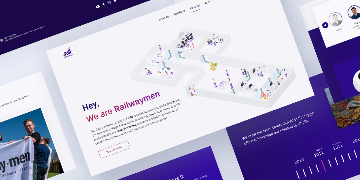
Railwaymen New Website About Us Section
I'm gonna be open with you all - it is very easy to find excuses and postpone your website redesign process forever. Because we don't have time for that. Because it requires money. We don't have enough resources now. Our clients are far more important for us than our online appearance - in this specific case, one doesn't exclude the other! As a result, you can delay your new website release forever - but it will bite you in the ass real quick.
How so? By losing business opportunities (equals: losing money), endangering your company image (the tag of the "outdated company" is very hard to get rid of), or scaring off qualified employees, who don't want to work for the company which is so obviously stuck in the previous era (a very important factor for the Millennials and Generation Z).
Table of Contents:
1. Why have we decided on our Railwaymen website redesign?
2. Our Website Redesign Process Strategy - Choosing the Dream Team Structure
3. A Website Redesign Checklist - How to make the whole process as smooth as possible?
4. 21 Things our Website Redesign project taught us - the whole team perspective
Why have we decided on our Railwaymen website redesign?
For quite some time, we were fully aware that our website is our weakest marketing spot. With our Railwaymen blog thriving, new partnerships growing (more about them in our Railwaymen 2020 recap) and complex projects we developed for partners from industries like Construction, MarTech or Social - our website stayed behind. We've changed a lot in the previous 2 years, growing our Product Design, Quality Assurance or Marketing teams, simultaneously exploring entirely new technologies. Besides Ruby on Rails web development, we nowe code in Vue.js, Golang, NodeJS, Angular.js, and React.js, exploring new mobile development possibilities, by introducing React Native.
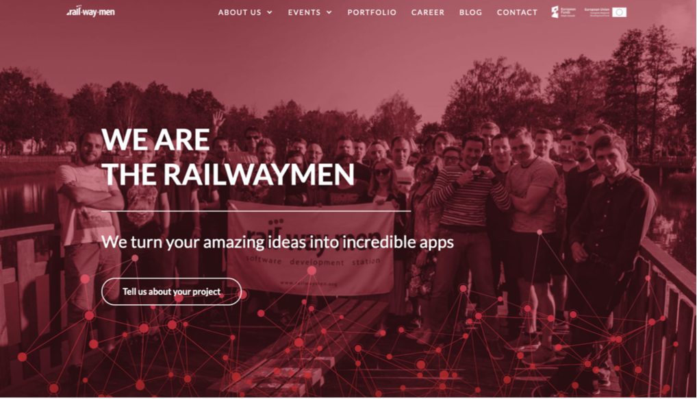
Our Railwaymen old website main page
Yet our website was still red as we were "only" Ruby on Rails development software house. And our potential partners perceived us as one. Fun fact: we've conducted a UX/UI Qualitative Analysis on people, who have never visited our website before to tell what exactly we are doing. A majority of them told that we look like some non-profit charity organization, because of these strong colors and people in the center. They've completely overlooked the word "apps" on the second line and had no idea that we specialize in custom app development.
Studies show that it takes about 50 milliseconds (that’s 0.05 seconds) for users to form an opinion about your website that determines whether they like your site or not, whether they’ll stay or leave.
That was a wake-up call for us all. In a highly competitive world of app development, every detail counts. From this moment, the goal to redesign a website became our priority. The decision has been made: let's collect the best team for our website redesign project!
Our Website Redesign Process Strategy - Choosing the Dream Team Structure
To redesign a website successfully you need a team of people with various competencies. In our Railwaymen case, our core team structure & responsibilities looked as follow:
Marketing Manager + Content Marketing Specialist
Meaning my beloved girl-boss Anna Klepacka and myself faithfully - Izabela Rokita. We were the ones who started all of this website redesign fuss. Based on our thorough Google Analytics and Hotjar research we identified weak spots that our current website had. We made it by answering some of the website redesign strategy's crucial questions.
- Does it send a message, we want our potential partners to see?
- Is it informative enough?
- Aren't we losing some business opportunities, because of the lack of information or exposing our competencies the right way?
The business side of this website redesign project was very important. We needed to set factors which are most important for us in terms of marketing & sales, to raise or ROI and attract the type of client, we want to cooperate with the most.
Human Resources & Employer Branding Manager
Figuring out your website redesign strategy you need to bear in mind, that not only your potential partners will visit it. But also people, who want to become your company employees! That's why our HR Manager Iwona was also deeply engaged in all of the matters connected with our careers page to make sure our recruitment goals will be met by it.
UX/UI Designer
Well, that's a pretty obvious one, it's impossible to redesign a website without a User Experience specialist right? In this case, the person responsible for designing our new website from scratch was our UX Designer Patryk, with whom we already cooperated within our marketing team daily. I and Anna gave him examples of websites that we thought we could get inspiration from, simultaneously adding a bunch of our very own elements to it. In the end, with the help of other Product Design team members Sylwia and Anna, we've come up with our entire website's final designs in Figma. If you are interested, how the UX/UI Design process looks like in our company from the very beginning to its end - you can read more about it here.
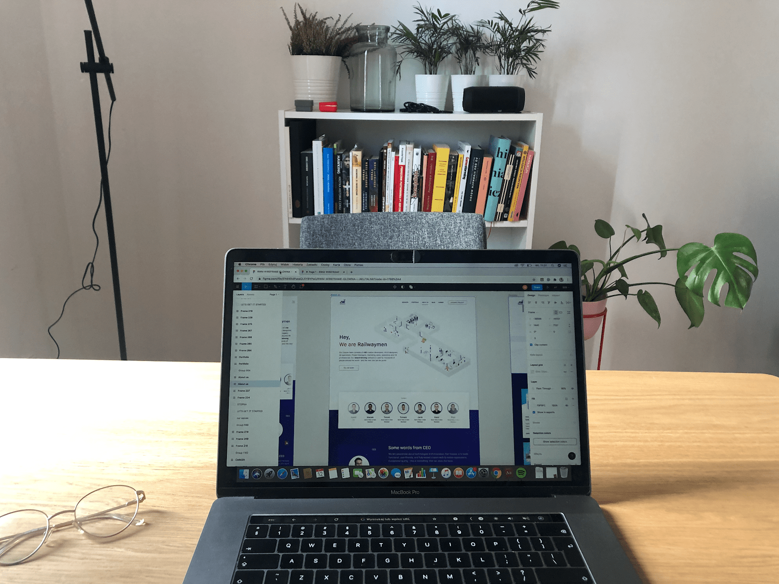
Railwaymen new website - UX Figma design
When the UX Design works were roughly done - I've started creating the whole copy for the website. But more about it later!
Front-End Developer + Front-End Designer
As our website designs were already filled with awesome visuals and content, there came a time to make it clickable! For this task, we needed 2 Front End experts - Wioleta, who built a very solid foundation for our site, and Konrad, who then took over the works, implemented all the amendments, and raised the website's general performance. In plain words, front-end developers' goal is to make the website look and work exactly as the marketers & User Experience designers planned it "on paper". Without them it's impossible to redesign your site - so you have to make sure, to acquire ones when determining your website redesign team structure.
Back End Developer
Through the whole website redesign works we had some "silent partner" who got activated on various steps along the way. ;) And that's Szymon, our Ruby on Rails & Vue.js Back End Developer. Without him, our website redesign project would stop before even starting. He had to make sure that our new site would integrate well with external tools (like Hubspot), use the right database, work stable on the server and do a bunch of other things that are not visible with the bare eye. He also built a dedicated Admin Panel for us -but more about it later.
2 Quality Assurance Specialists
One of the most popular articles on our blog ever is the one about why quality assurance is so important for your project. So if you want to learn more about it, feel free to read it. In our case, 2 excellent QA specialists were engaged in the process - Paweł and Joanna. Thanks to their attention to detail, we were able to discover all of the potential bugs & errors before the release and fix them.
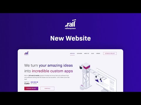
Our whole Railwaymen website redesign process took around 6 months (bear in mind, that all of our website redesign team members were simultaneously working on our partner's software and at the beginning of February 2021, we released our new website to the world. You can see the announcement video below!
Railwaymen site release announcement video
A Website Redesign Checklist - How to make the whole process as smooth as possible?
To sum up the process itself, before moving to the "what we learned'' part, I want to prepare a short checklist of the most important things you need to take care of before starting your website redesign project. And here they are as follows:
- Determine the general purpose of your new website redesign strategy - what are the business goals you want to fulfill with it? Do you want to communicate that you've changed the target audience of your services, for example - you were offering financial services to individuals, but now you want to shift to startups financial consulting? Or acquire new clients online, yet your website doesn't support acquiring leads through digital sources (because it's slow, outdated, not engaging, etc)? Or maybe you lack employees for your construction, financial or food-tech business, and you need ones of good quality fast? Choose 2-3 goals that are most important for you and focus on them. For others - you can always build a dedicated landing page.
Anna Klepacka, Head of Marketing at Railwaymen
Creating a website that is both functional as well as visually aesthetic and intuitive is a big challenge. From my marketing point of view, the basic element that should be taken care of while planning the creation of a website is to prepare the brand strategy. It is worth asking ourselves questions: who are we, to whom do we direct our offer, what distinguishes us from the competition, how do we want to be perceived by potential customers.
Before starting the design work, we defined with our team a clear goal that was to be achieved with the help of the new website, and it is the increase in traffic, conversion and sales rate. Hope you like it!
- Set up your site's ideal target customers - and "everyone who has money to pay for my service" is not what I mean. Your website visitors need to have a feeling that you made your site specifically for them. What is their age? What language do they use (maybe try other than English)? What benefits speak to them the most - making more money, saving time, or automating some tasks? As a business owner, you should know your target audience best, because you are the one who is in touch with them daily. Use that, to ensure the best User Experience possible.
- Choose KPIs to determine whether your site is successful or not - this could be anything, that matters to you. Acquiring more marketing leads or business opportunities. Selling more products. Building brand awareness. Raising traffic on your site. Redirections to a specific product in your shop. Make them as specific as you can, for example - with the new site I want to raise my sales by 200 % within 3 months. And then just create your website redesign strategy with clear goals on the back of your head.
- Determine your business Unique Selling Point - right now, almost in every industry, there is, the competition is huge. And an important factor why it is like that is the Internet growth. As almost every business is online now, you are not only competing with companies from your city or country but other continents as well! So you need to stand out. Think hard and without judgment, what are strengths you have, that other companies neglect or don't have at all.
Maybe you are one of the most experienced ones in your industry. The most awarded. Have bigger brands than others in your portfolio. Have a higher satisfaction rate or you are simply cheaper. From the very beginning of your website redesign activities think about the ways to show it on your website. Use testimonials from your partners. Show your awards. Praise the competencies of the team that is working for you. Anything you know can make you stand out and bring real value to your potential customers!
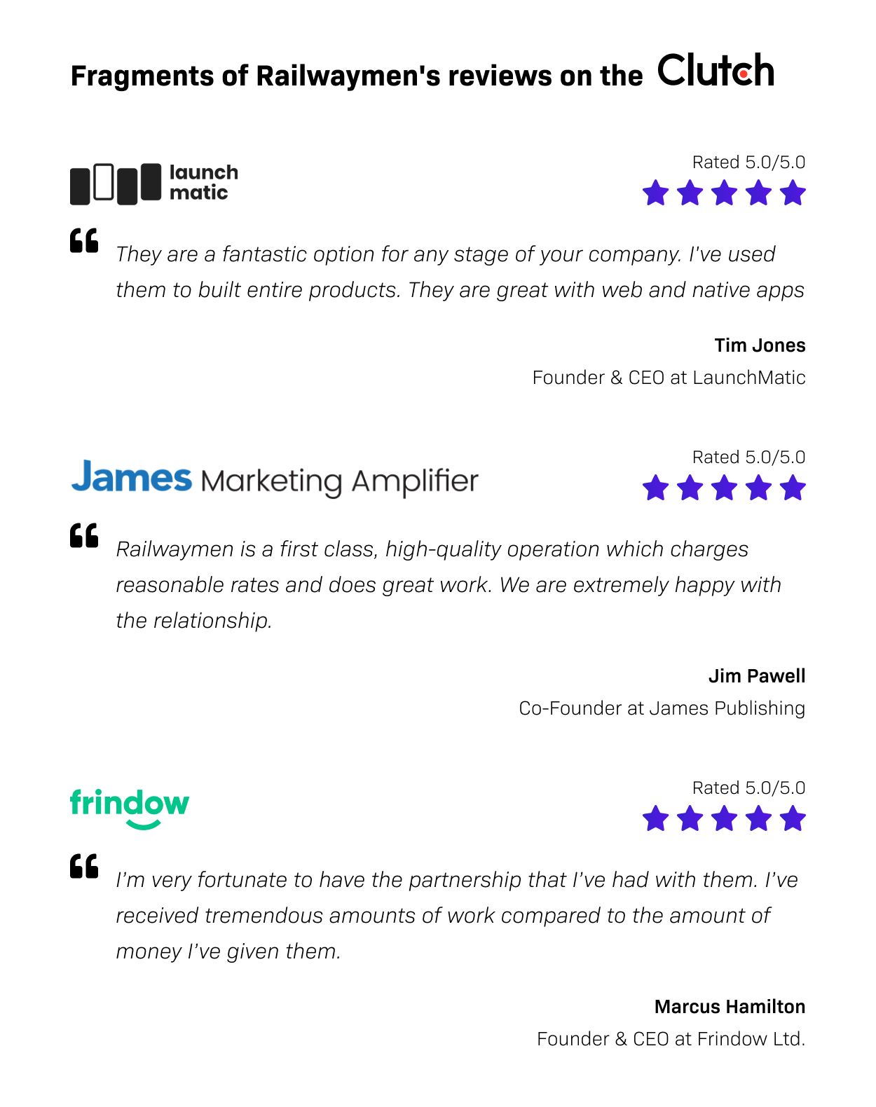
Examples of our latest Railwaymen Clutch.co reviews
- Find the right people to redesign your website - in our case, we had all that we needed under our noses. As we develop web & mobile applications for +11 years already, doing everything in-house, we didn't have to hire anyone from the outside to achieve our goals. Unless you are a software house as well, you will probably need to look for help outside of your business. There are several ways to do that: you can hire freelancers or go to a software development company that will do everything for you - marketing & business strategy included.
There are not a lot of software houses on the market that provide business consulting expertise. But it happens to be that we at Railwaymen are one of them. Just approach us, requesting info about our Discovery Phase service and we will help you with your website redesign strategy and much more!
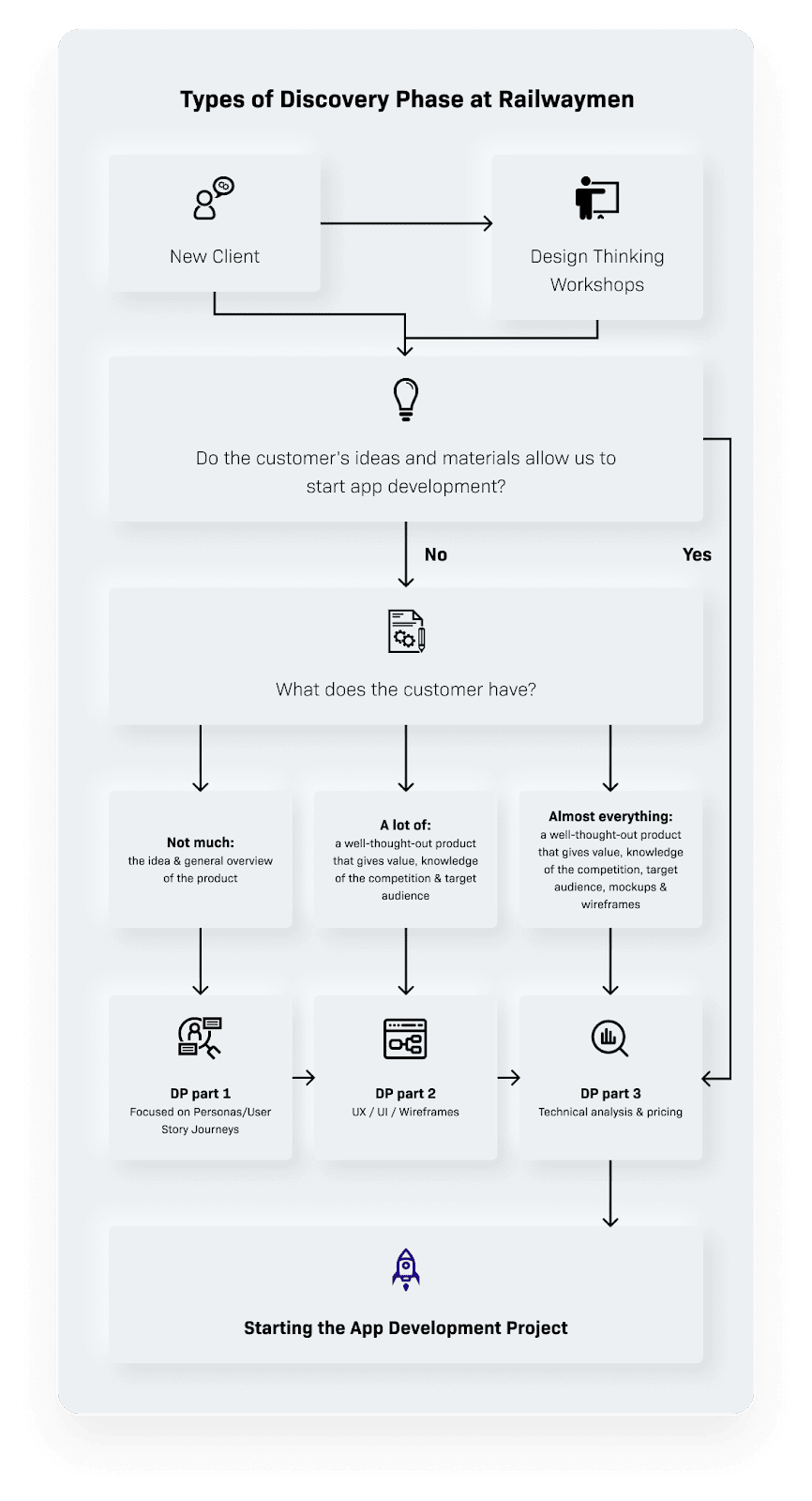
Types of Discovery Phase at Railwaymen
- Set a timeline for your website redesign project - you need to ask yourself a question, and answer it honestly - how much time will I have, to engage in creating an entirely new website for my business? This also kinda answers the question, should you use freelancers or a software house. When choosing freelancers, you need to coordinate them. With a software house, you have a dedicated project manager who does that. Yet setting time boundaries to redesign your website is crucial for your business. Bear in mind - each day of delay can cost you losing valuable opportunities. Also, your competition is right after you. Set up the exact date that you want your website to be finished. You can always make some amendments afterward. But without dates, you can stick up polishing it forever and that's not something anyone wants.
And that's it when it comes to absolute foundations that you need to build before moving to work on your new website design.
21 Things our Website Redesign project taught us - the whole team perspective
For most of our team members, it was the first time to be engaged in the website redesign process for a software house. Even though we at Railwaymen provide custom software solutions for various industries like construction, social, martech, food tech, fintech, or education daily - B2B app development solutions are something entirely different. The budgets are bigger (starting at the 20$k for the MVP) and the projects last for 3 months minimum. So it was a great opportunity for all of us to learn something new while building our site - and we want to share it with you below!
#1 People want to know more about you, before starting a business
On our old website, there was a missing "About us" section. Nowadays it is more and more important for potential customers to know better the people they will be working with. And if maybe in the case, when you are buying some shoes online it is not so important - in B2B it's a matter that can vary greatly, whether you acquire a partner or not.
So we created that section to explain better our values, work ethics, and what distinguishes us among other software providers. And those are an exceptional team (most of our developers are seniors), high business expertize (we don't develop software that we don't see a business potential at) and team stability, thanks to a very low developers rotation. I think that this new website section greatly emphasizes those matters! We already see that our potential partners willingly visit this site and then, move to the contact form.
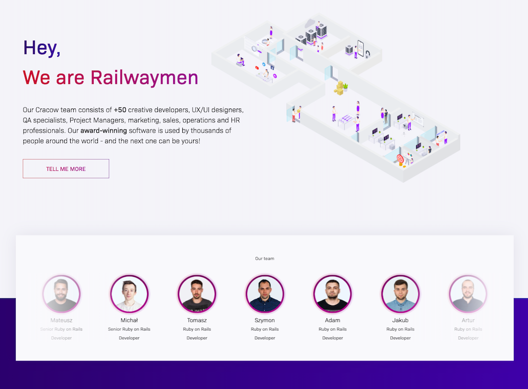
Railwaymen new website about us section
#2 Search Engine Optimization is super important
When creating your site, you need to decide what will be the sources that you acquire your traffic from. Will those be paid ads, media coverage, or search engine. In our case, we see that organic traffic (SEO) is of the highest quality from all of mentioned above. Simple psychology - you will most likely buy something that you already want to buy or think about buying, than when you see an ad offering you a product/solution you've never heard about before. And SEO brings to us people who already got so interested in the topic, to Google it by themselves.
That's why while thinking about how to redesign your website well, you should take good care of your website content Search Engine Optimization (SEO). It is now too soon to tell the results, but within a few months, we will definitely share some! So if you want to succeed with your website organically - think about SEO from the very beginning!
Izabela Rokita, Growth Hacker at Railwaymen
This whole site redesign experience taught me how important it is to write a good copy for your website. The one that is engaging and tells as much to the website visitors as possible, without boring them. Numbers help there a lot as in the world of business, they often tell more than hundreds of adjectives.
Also as a website content writer, you need to constantly think about SEO optimization. In the end, I’m proud of myself because I believe that I’ve delivered texts that are pleasant to read both for our potential business partners and Google robots - and they both tend to be very demanding!
#3 Your website has to look good on various mobile devices
In our specific Railwaymen website case, the traffic from smartphones reaches around 25 %. Around half of them use Apple devices, and the second half - other ones like Samsung, Xiaomi, or Huawei. How do we know this? Google Analytics. It is a very powerful source to getting knowledge about your audience so it's very important to use it while conducting your website redesign works. This was also important information to our Quality Assurance Specialists - to know, on which devices they should focus on while testing our new website.
We've prepared separate mobile designs during our website redesign strategy meetings implemented them and then made sure that they look good on different mobile devices/mobile internet browsers. This way, we also increased our mobile devices lead generation number, as people more willingly fill up forms, that are mobile-friendly. Responsive design is key here!
Important note: when working on SEO optimization of your website content make sure that it looks good on mobile as well. It happens to be that your perfectly SEO-optimized copy transforms into a "wall of text" on your users' mobile devices. Finding a balance here is crucial when working on delivering your website redesign services well!
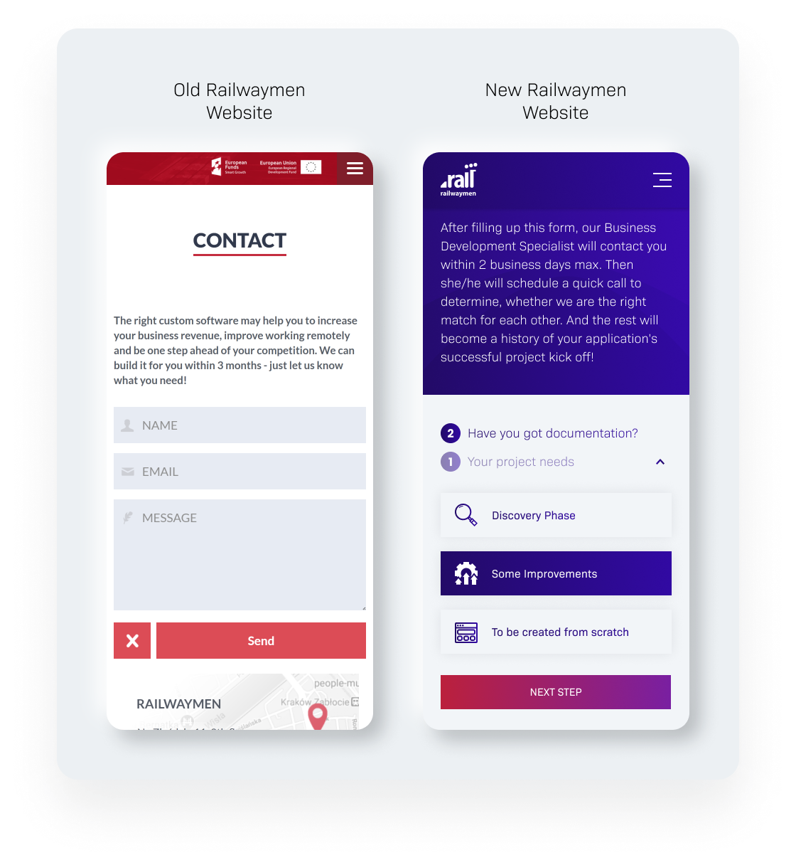
Railwaymen mobile contact form
#4 Building Admin Panel will make your marketing job much easier
We've already covered deeper the topic of Admin Panel importance here, so I won't dedicate time here to explain what it is. Let's just say, that without it, our Marketing Department would need to ask our developers to implement even the smallest change on our website. But on our new website - we can do it by ourselves, and that's because of the Admin Panel. It enables us to add new technologies to services sections, post job openings, and new projects, and much more. Basically, it is our new site content management system. When asking some providers for their website redesign services ask, do they build an Admin Panel as well? Trust me, you might need it a lot later. See how ours look like below!
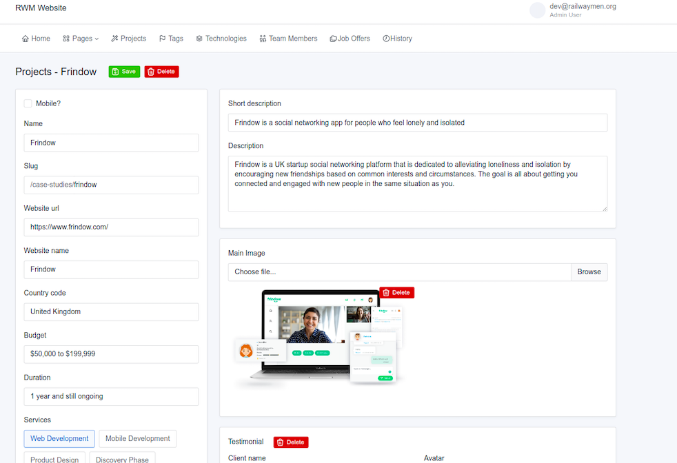
Railwaymen Admin Panel screenshot - adding new project section
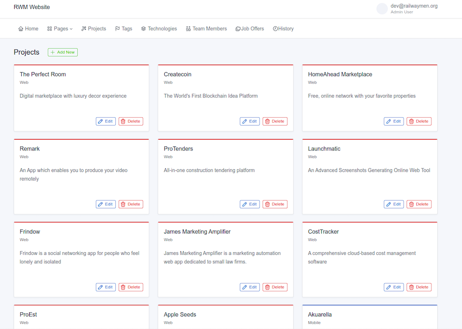
Railwaymen Admin Panel screenshot - general projects view
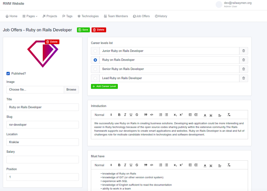
Railwaymen Admin Panel screenshot - adding a job opening
Szymon Chodzidło, Backend Ruby on Rails Developer at Railwaymen
Company internal projects (such as our Railwaymen new website one) are a great opportunity to test new tools and solutions without the risk of not keeping up to the deadline. Being a part of the website redesign team helped me to upscale my Front End Development skills, and with the help of a newly discovered Tabler - a UI library, we’ve managed to create a very clear, and easy-to-use website Admin Panel.
The website redesign project was also an excellent chance for me, to test myself as a Project Leader and mentor in general, which resulted in getting more confidence and experience, which I will use standing up to the new challenges!
#5 Project Manager is a must-have
Honesty time - we could probably finish our website redesign works sooner if we had a dedicated Project Manager. From time to time, each of our teammates kinda stepped in that position, and because we knew each other and were technically well-educated, we constantly pushed the works forward. But it would be easier with one person managing all of our works - so if you wonder, if you need a Project Manager when developing your custom software the answer is YES.
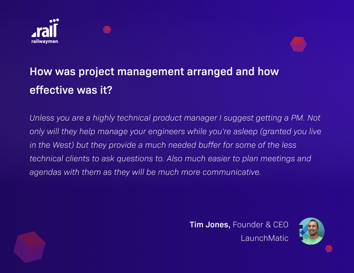
Our partner Tim Jones from clients review
I guess this is one of the most important lessons we got from all of this process. Even the most hard-working and talented people can get lost, if they're not sure what tasks are priorities at the moment and which are not. The Project Manager takes care of that, alongside communicating how much work has been left to the end, explaining even the most complex technical matters and generally changing chaos, into fully functional software.
Joanna Gilarok, Junior Quality Assurance Specialist at RailwaymenFor me, it was really fun to enter the tests at the very end, without knowing anything about the site before. Dive deeper into a sea of different solutions that were implemented there. Test simultaneously on iOS, Android, browsers, and check Figma. And to realize how important an element of the software development process is a Project Manager, which unites the entire team!
#6 Quality Assurance is a necessity - even in the case of the websites that look simple
We've almost made that mistake along our process - got so super excited that our website looks good & works (at the first sight!) alright that we wanted to speed up the release. That would be a very bad decision! Even in the case of a "simple" website like ours, during the Quality Assurance process, a lot of small bugs and errors have been detected - as it always happen, when you test your software really carefully. So we decided to take a deep breath, and postpone the release till we fix them. Why? Because we could completely ruin our reputation by going live with a website that is just not working alright.
This one extra month for QA & bug fixing was a very important part of our website redesign efforts, ensuring that the product we are showing to the world is the one we want to sign our names on.
Paweł Kamykowski, Quality Assurance Specialist at Railwaymen
Working on the website redesign project allowed me to convince myself about the power of team testing. It was great fun to test this project where new tools and solutions have been implemented. I also really liked this new website's very modern design, which made the whole QA experience a real pleasure!
#7 Ruby on Rails is not dead
From time to time we hear voices that Ruby on Rails is an outdated technology. So what is the better way to prove everyone wrong, than build or website entirely in this technology? This stable and mature programming language enables you to build beautifully designed and smoothly working websites - and we are experts in it! We serve our website redesign services to our clients in this technology as well. You can read more about why Ruby on Rails is NOT dead here.
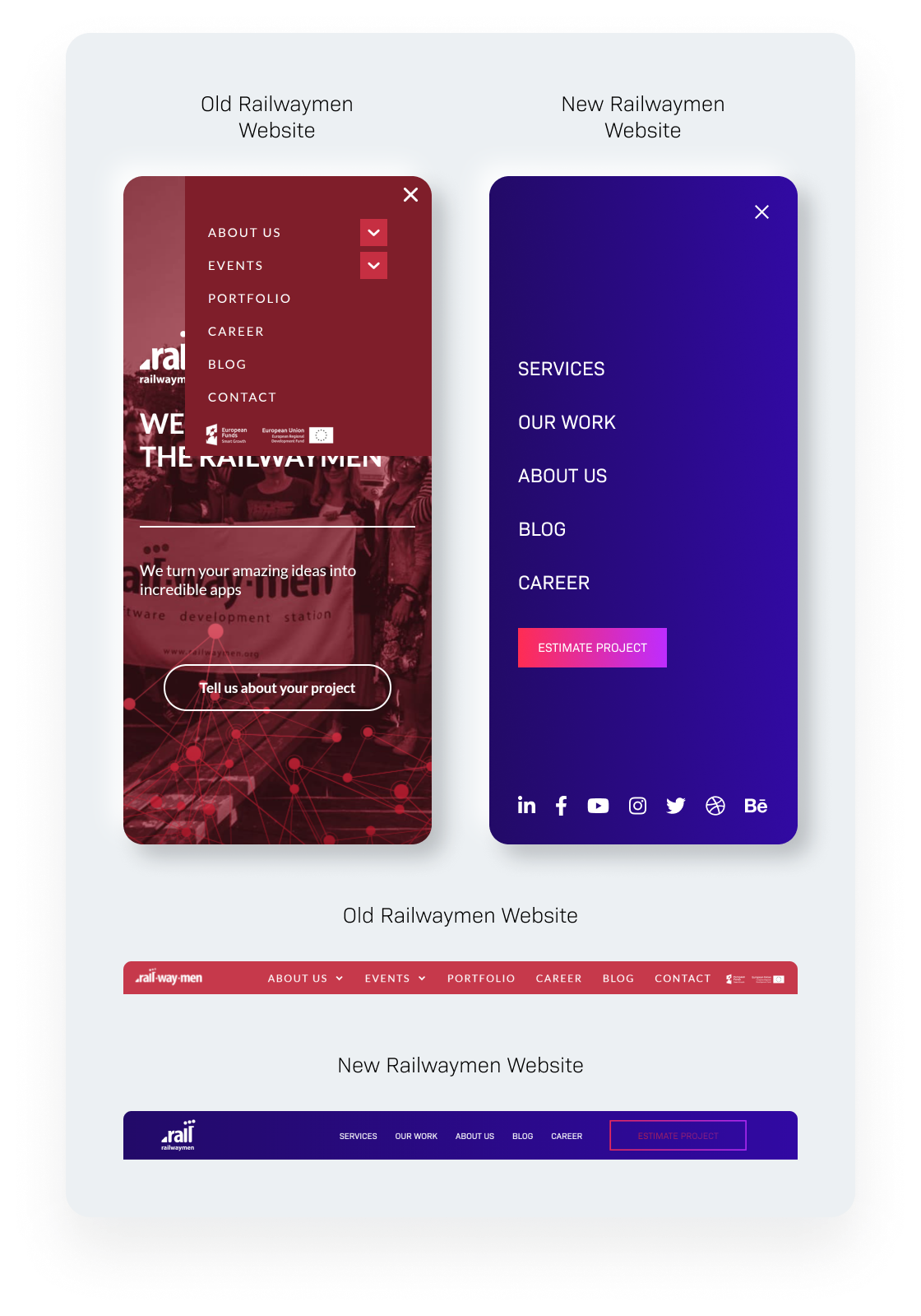
Railwaymen new website general navigation
#8 You need to provide as much Infos about your company services as possible
Another thing that we found missing on our old site during our website redesign process was something very obvious - a Services page. You have to make sure that your web design includes places, where your target audience will easily find out from, what is the scope of your work. Even though for us, it was obvious that a software house does web development, mobile development, product design, and business consulting - it wasn't like that for our users. So once again it appeared, that good content is a king!
For example, many of them had no idea that we make mobile development as well! Seeing red colors and rubies all around on our current website at this time they were sure that we only do web development and only in Ruby on Rails. Which was simply not true! Luckily, on our new site, you can see all of the services we do, what technologies we use to accomplish them, and much more.
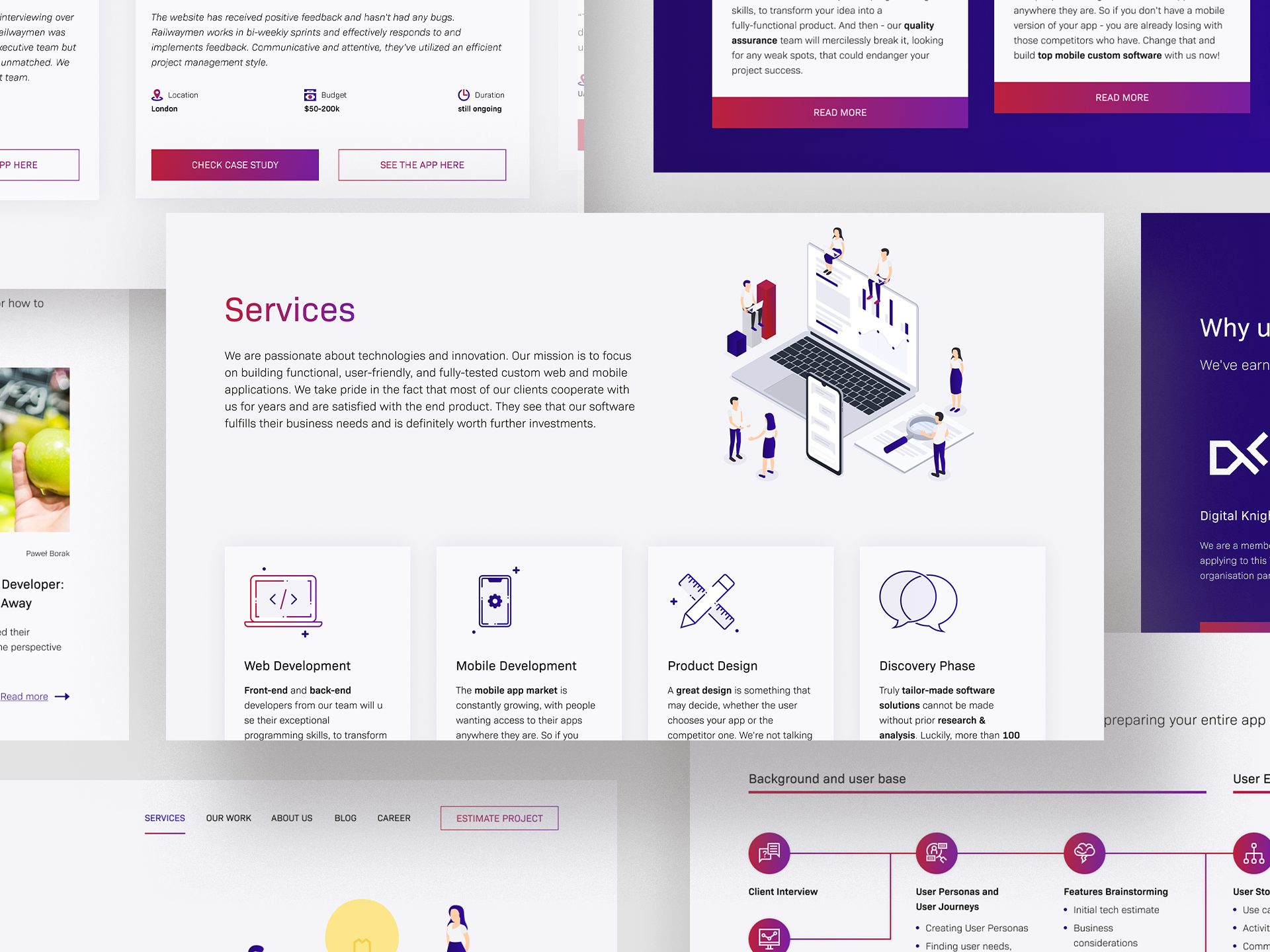
New Railwaymen website services page
#9 It's worth showing your team member faces
This one is highly connected with the “people wanting to make business with people's” assumption. We have many great specialists in our company - why shouldn't we show them more? Especially as when we were analyzing the previous website pain points we've noticed that a lot of people visit our website but don't contact us eventually. So to raise our conversion rate, we've concluded to show the people, who will be your first contacts when you decide to consult your app idea with us.
So of course, our CEO Łukasz, who is very much involved in clients onboarding process & taking care of their satisfaction rate throughout has made the front page ;) Besides him, you can see our Head of Marketing Anna, who will perform a marketing intro & consult you on the strategy, to promote your business efficiently and HR Manager Iwona - who will be the voice on the phone & face in the office, when you decide to apply to us!
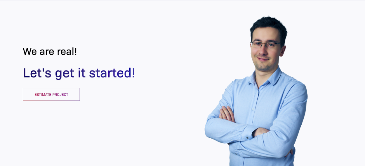
Railwaymen website CEO Łukasz Photo

Railwaymen website Head of Marketing Anna photo
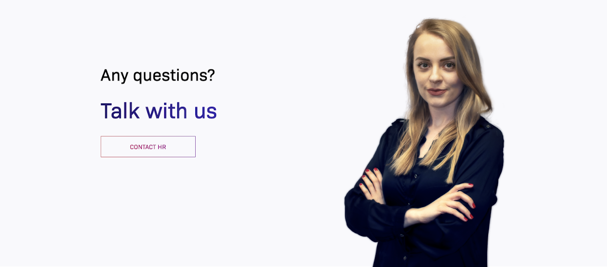
Railwaymen website HR Manager Iwona photo
#10 Your website visitors have to know instantly what is your business core
Remember about some non-profit charity organization's first-look resemblance? Ouch, that got into our heads. So while building our current website we wanted to make sure that no one will mistake us for who we are not. We are a software house, we design web & mobile applications, build them and test to the bone. And I think now, our new web design states that clearly.
The idea behind the crane building apps we got from our industry expertise. As one of the few software houses in the world, we highly specialize in building custom software for the construction industry. So we thought - hey, let's use that, to stand out from the crowd! On the front page, we also wanted to emphasize inside the copy, that we're not some newbies in the business. +125 apps made, +11 years of experience - that's something that speaks "professionalism" and "stabilization" to our customers.
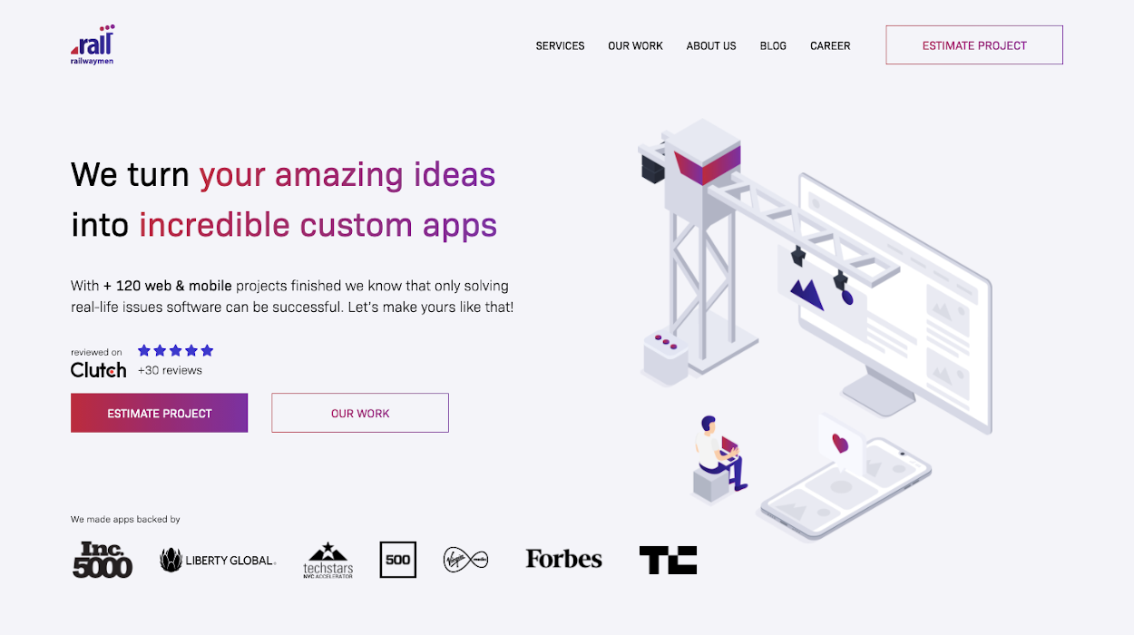
Railwaymen new site main page
#11 Agile methodology works like a charm while website redesign
Oh yeah, this website would never become a reality if we were not working in sprints. As I mentioned before, we didn't have a dedicated Project Manager. The person who was the most "in charge" one changed a few times - at the beginning it was Anna, then Szymon, with myself at the very end. We were meeting once a week for the whole 6 months to discuss, what has been done, what needs to be done, and who is responsible for which tasks. Everything was stored in Jira, where we had our dedicated Railwaymen website redesign project board, with tasks assigned to a specific person.
The project organization and workflow are crucial to its success. At the first sight, a website is nothing like an advanced content management system or email marketing software BUT - it doesn't mean that it is easy to build one. After all, it needs to fulfill your business goals and work well in terms of performance, lead generation and help you make money! So don't neglect that part of the software development process because it can slow down your work greatly.
Iwona Walczak, HR Manager at Railwaymen
Being involved in that project taught me teamwork during the web development process. It was a great technical adventure and an amazing experience! I found out why the UX is the key to website success! Well-prepared content may not exist if the user path is not carefully thought out.
#12 Big brands & organizations raise your business credibility
We at Railwaymen work with big brands and are a member of some very exclusive software development organization - but you couldn't tell that from looking at our old website! Logotypes, recognitions, testimonials - these all greatly help with your digital marketing effort. So on our current website, you are finally able to see companies like Liberty Global, Forbes, and others that backed the software that we've built.

Railwaymen current website companies logotypes
We've also been a member of some prestigious organizations, like Digital Knights (only 7 % of software development companies applying gets in!) and SODA - Software Development Association in Poland. On the new website, we've dedicated a special place to make them visible.
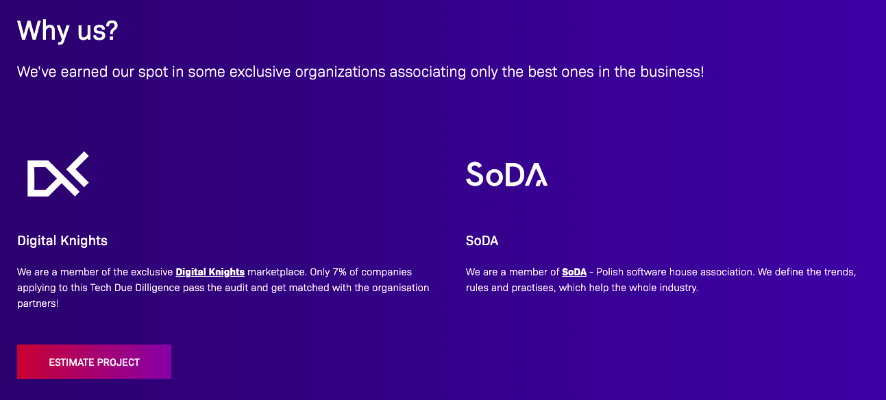
Railwaymen site organisations they are a member of - Digital Knights and SoDA
#13 The more complex website design = bigger challenge for the Front End Developers
Comparing our old site to our existing website - it is far more complex and modern! Thanks to great attention to User Experience, and following the latest trends in graphic design, our UX Designer Patryk managed to prepare a website design that truly stands out with its quality and freshness. When you decide to redesign your website you need to answer yourself a question: do I need a website fast or do I want to dedicate more time & resources to it, to make it more appealing to my customers?
We at Railwaymen decided on the second approach and wanted our new website to fulfill our business goals such as higher lead generation, more web traffic, lowering bounce rate, and more. To make it a core of all of our digital marketing efforts. That way we needed to engage Front End developers, who are not afraid of challenges and will be excited about some new things alongside the whole process. And our existing website is the result of their best practices, learned on our clients' projects, implemented on our site.
Konrad Kubrak, Senior Front-End Designer at Railwaymen
With beautiful design comes great responsibility - I have a feeling that this paraphrase of a superhero's words was guiding the work that our front-end development team was doing.
It was a big challenge, but also a great learning experience, both for our Junior Frontend Developer Wiola, who passionately started the work implementing many innovative solutions, and for me - because meeting all those assumptions and making the project accessible on all devices was not an easy task. We took up this challenge by developing the code completely from scratch, implementing new technologies - thanks to which it does not have any unnecessary lines, which has a very positive impact on its performance.
#14 Showing your industry focus is a wise decision
When you ask most of the software houses "who is your client?", a majority of them will give you answers that can be summed up to a sentence "everyone, who has got the money to buy from us". And that's not the way we want to make business at Railwaymen. Through the past 11 years, we grew to create an action plan, which helped us determine who our customers truly are. This required answering a lot of questions, deep data analysis, and developing a marketing strategy, which will be more focused on specific segments of clients. As a result, we chose 6 industries that we are most confident in the construction, martech, social, food tech, fintech, and education.
Of course, we can provide custom software for another's sectors as well - but these are the ones, where we feel we can provide a more strategic & business-wise approach, thanks to our experience. So if you need a website or custom software, to attract more customers to your product, automate some repetitive tasks, or become an app entrepreneur, who makes money through software - just leave us your email address here.
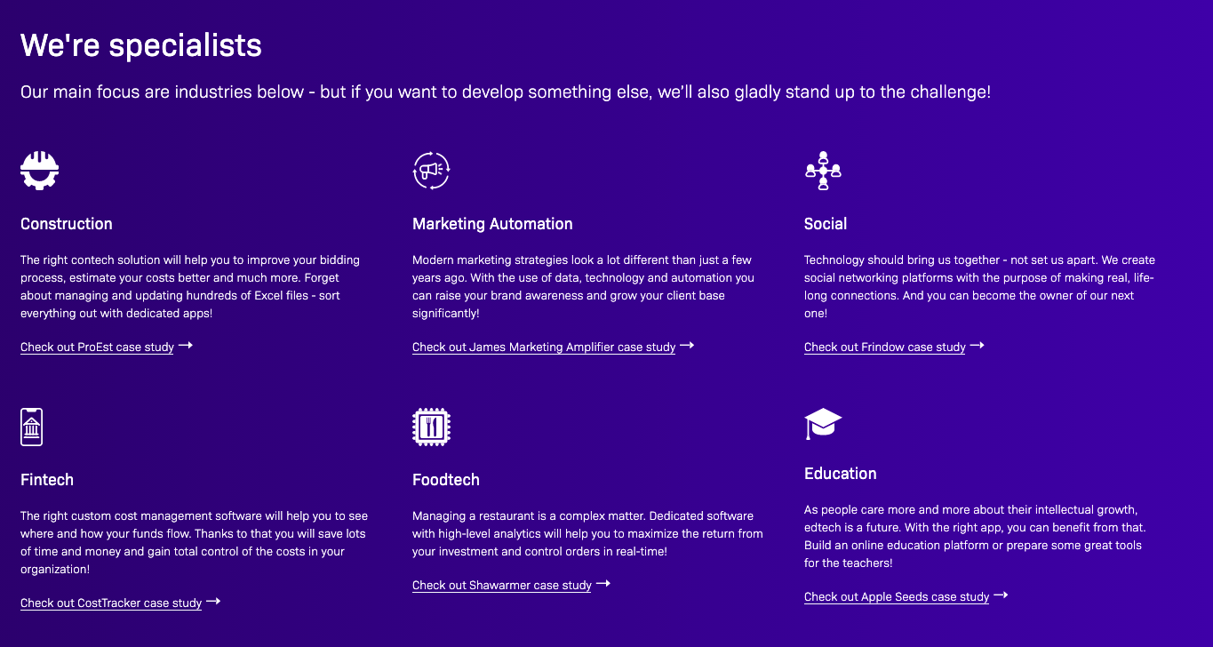
Railwaymen new website industries of expertise
Need a help to figure out, what kind of industries or potential group of clients should you focus on while designing your website? This kind of market research is also included in our Discovery Phase service.
#15 Using numbers in the website copy speak louder than words
We, business people, love numbers. So after the redesign, our current site is full of them! When I was hire a for our website, I was wondering what will speak to the users the most vividly. You can write sentences about how great your application is, what functionalities does it have but if you want to keep it short and sweet, use numbers. How many active users does it have monthly? How much money do the app owners raise thanks to it? How many times has it been downloaded from the Appstore?
If you have that kind of data - emphasize it while building your site! The users need to know that your solution will help them to achieve their business goals. On the bottom line - that's what is the most important for them.
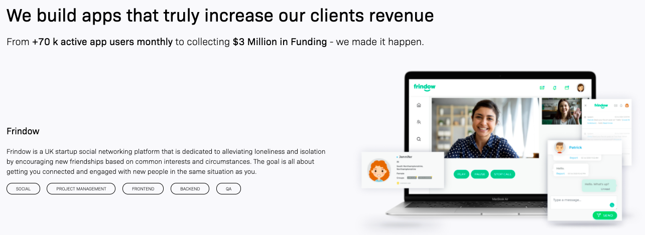
Railwaymen site numbers in content usage example
#16 You need to emphasize your previous successful projects
One of the most popular sections on our previous Railwaymen site was "Portfolio". During the website redesign, we changed that section title to "Our Work" and filled it with case-studies from our clients' projects.
The design of this site changed a bit on our existing website, to show better the areas we are focusing on (industry tags) and of course, it transformed its general look to be more aligned with the entire web design. We followed some website redesign best practices, to create a responsive design, to truly capture our partners' awesome applications. See the before and after comparison below!
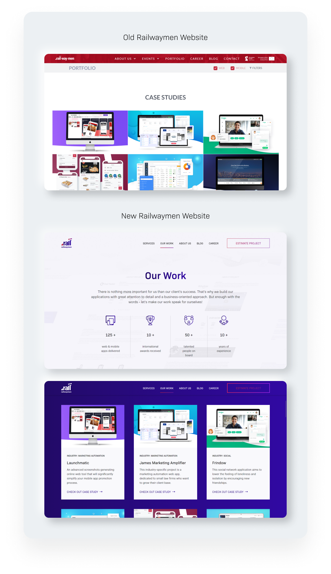 Railwaymen site our work section - before and after
#17 Your happy customers are your business best ad
You need to know that no piece of content can be so persuasive to your customers as happy clients review. Seeing those people, who are willing to say some positive words about a company, signing up under their names and surnames, answers a lot of questions in your customers' head.
That's why during our website redesign works, we've decided that on our current site, our partners will have a lot more to say than on the old one. Showing their faces on photos & videos is a great way to gain trust among your future customers before they even reach out to you. Previously, we were mostly showing our partners faces, when they visited us in our office and vice versa on social media. Now there are lots more of them on the main website + services individual pages!
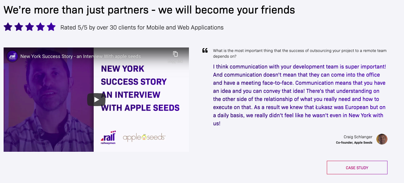
Railwaymen website redesign appleseeds
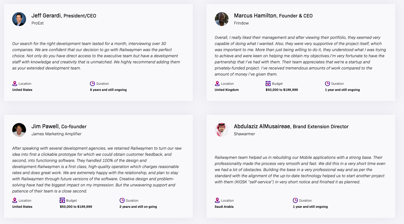
Railwaymen website redesign testimonials
#18 Designing a contact form that fulfills your business goals is a challenge
One of the main things that your website should do is to transform its users into customers. To make that happen, you can create various landing pages, write blog articles or create ebooks that you will send in return for their email address. Nevertheless what most of these solutions have in common is a subscription form.
You might be surprised how big of a challenge it is to build an estimate form that will work and look well with your general web design. At the same time, it has to fulfill your marketing & sales goals, which is often getting as much info about customers as we can, when the user experience perspective is to make it as simple and short as possible. And these two approaches have to find some common solution when redesigning your website!
Luckily, our current Railwaymen website redesigns project effort helped us to meet both of these goals. We already see a higher conversion rate on our Estimate Your Project form, simultaneously gathering a lot more data, than we used to before!
Patryk Zawadzki, UX/UI Designer at Railwaymen
The most interesting element I worked on during the redesign of the Railwaymen website was the contact form. While working on it we had to make it not only user-friendly but also provide as much information as possible to the sales team.
Therefore, we first gathered information about the data we needed to collect from the user and then divided it into several dependent steps. Thanks to this, the user answers only the questions that are important to us, and we can choose the right service for him.
#19 External tools integrations can become a bigger challenge than you think
At Railwaymen as a Customer Management and Content Management System, we use Hubspot. And integrating our site with this Sales & Marketing tool was very important to us, to track conversion, collect more Infos about our users' behaviors, and fire up chatbots/pop-ups. And this part was pretty easy - we just needed to paste a Hubspot tracking code and voila it worked.
The more complex matter became integrating our new Estimate form with Hubspot to make sure that all of the data will be properly collected in this tool. Another challenge was that we wanted to get our Blog articles automatically updating on our website sections. On the main page: all the most up-to-date ones, and on services individual pages the articles with the specific Tag so: on web development service page articles with web development tag, on mobile development the ones with mobile development tag, etc. In the end, it took some extra time to figure out Hubspot external API but luckily, everything is now working like a charm!
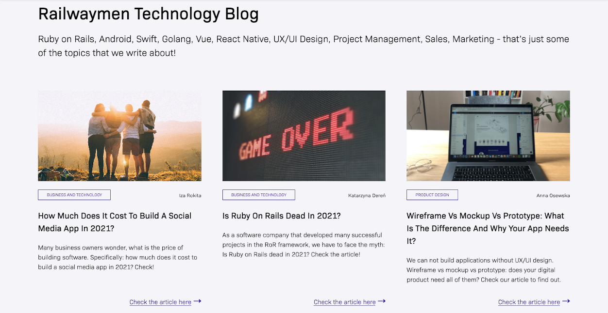
Railwaymen website redesign blog section
#20 Website redesign is a great way to get media attention
It's not easy to get your dream customers' attention these days, that is a fact. Nevertheless, after we published the info about our website redesign works being done and revealed the new Railwaymen site to the world, we got so much positive feedback from the market! The post on LinkedIn got significantly more attention than the rest of our publications and people were congratulating us on our work in private messages. So if you plan to redesign your website - think about how you will announce the end effect to the world as well. Because it's a media opportunity that you don't want to lose!
#21 A good website redesign is impossible to be done by one person
During our website redesign efforts, I've come to an interesting conclusion - how the heck some web designers freelancers are offering the whole website redesign services all by themselves?! As I see now that it's far too complex to be made by one person. To conduct proper website redesign works you need a set of professionals from different fields who together will take care of various aspects of your site. They need to know what is expected of them and focus on this part.
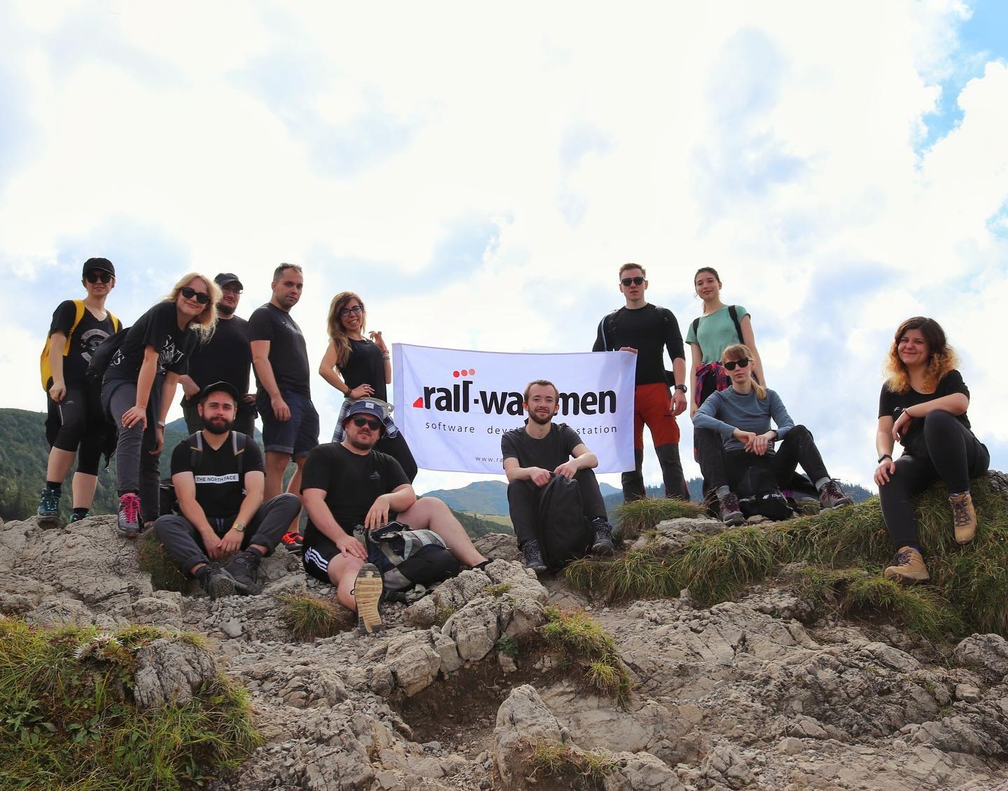
Railwaymen team hiking cruise - you can see here Iwona, Anna, Szymon, Sylwia and Izabela which where engaged in the website redesign works
UX Designer needs to focus on creating a beautiful, and user-friendly design. A Content Marketing Specialist has to take care of SEO, page titles, and other activities, that help to build a great brand identity. The Head of Marketing has to supervise the content, SEO and share detailed Infos about current customers, to adjust the brand site message to them. Quality Assurance specialists need to focus on finding bugs and errors. Front End experts focus on finding the right tools and technologies to transform design elements into a live, working website. And Backend developers have to take care of everything that's under the website hood - integrations, databases, building Admin Panel, and more.
Building a website is a challenge. So when you are thinking about the way to make it most efficient - hire a team. And as best the one, who has got some experience in delivering together some website redesign services.
Conclusion
How to tell that you need a redesign? Just answer yourself some questions: do I feel that my site still reflects the business that I'm running now? Are all of the important Infos easily available there? Doesn't it simply look old? Redesigning your website is a complex process, there is no doubt about it. But the results it can bring to you at the bottom line are hard to compare to any other marketing effort! Because what is the point of running an expensive advertising campaign, when in the end, customers will just bounce back from your looking old and unappealing site?
Happens to be that we offer website redesign services as well. So if you want to get your site refreshed by experts, who build websites and software solutions on a daily basis - check our Product Design service section below!
I want to know more about your website redesign services!




![project discovery phase: how it looks on app example [free template]](https://2581766.fs1.hubspotusercontent-na1.net/hub/2581766/hubfs/Poject-discovery-phase-cover-min.png?width=1905&height=510&name=Poject-discovery-phase-cover-min.png)